Wednesday 31 December 2014

Exaggeration in 3D Animation

If there is one thing I love to see and do is exaggeration. I think exaggeration adds a lot to a scene in animation, because it makes every motion in the scene so much more engaging and imaginative. I particularly love in kid's shows like Spongebob and Ren & Stimpy when they really have fun with the art style by pushing the flexibility of their characters.


These two shows manage take something as simple as eating and make it look interesting and hilarious, just by exaggerating it. That's why I love animation like this, because they really know how to go off-model. I can accept weird stuff like Ren's mouth and head changing size and shape like that, and Spongebob's tongue and left arm stretching to those disproportionate lengths because the transitions and the motions feel natural with the animation.

This is the benefit to animating in 2D as opposed to 3D, because you can be much more loose like that in 2D. With 3D, it can be really difficult to pull off a style like this, without completely destroying the 3D model in the process, being really good at making 3D character models, or, if you're really desperate, making multiple 3D models of the same character (though I highly doubt anybody's THAT crazy).

Though, that's not to say it's impossible. Films like Hotel Transylvania and TV shows like Teenage Mutant Ninja Turtles are brilliant at exaggeration, for example.


With that said, though, it is clear that a lot of skill and effort is put into making 3D animation stretch like this, the problem for me is that it doesn't really translate as well with 3D as it does 2D animation. The transitions are hella smooth and the emotions are well-acted in the examples shown above, but I just think this style was always meant for 2D, and there's probably more reason that to wonder about why this style is rare to find for 3D animation.

Working with Dope Sheets

I was introduced to dope sheets the other week, which are basically plans on where and when to place the audio within a frame of animation. It is particularly useful for lip syncing in character animation, during scenes that require dialogue. To be honest, I'd learned about dope sheets a while ago from the Animator's Survival Kit, and they looked just as terrifying then as they did this time. Granted, I have learned to get used to them, since I was given a very simple dope sheet that was rather easy to get into. I can actually get behind using dope sheets more often in the future, because I found it way easier to lip sync this way. It would also be useful to animating in general, really, especially overlapping and secondary actions.

Using the dope sheets I was given, I was able to practice lip syncing on Maya. I made this video with the phonemes and audio I was given:


Cinematography References: Film Noir

Having studied the sub-genre, film noir, I have always enjoyed the many different methods that are associated with film noir, due to the typical nature of the camera work, lighting, and use of shadow. I've always thought the appeal of black-and-white stems from the amount of effort put into cinematography, because film noirs tend to succeed at being visually unique and brilliant despite the lack of colour. Speaking, of course, on behalf of classic film noir, which, by focusing attention on all the other aspects of cinematography, managed to encourage very creative ways to depict black-and-white film, giving the genre a unique and unforgettable look.

My favourite technique used in film is definitely the dutch tilt, because of how well it depicts the dread of a scene, usually from a character's perspective. It seems to have a lot of uses, but it is mainly used for adding a sinister touch to the scene.


See what I mean? I look at these images and just feel the intensity, simply from the cinematography. The shadows, the camera angles, the low key lighting, are all the reasons I just love this genre and why it influences me. This was one of the reasons I changed the style of my animation to match this style, because of how effectively it conveys the tone, and it translates well into animation.

Sunday 28 December 2014

A Change in Style

This happens quite rarely for me, when I get a sudden need to change the art style of something I'm in the middle of creating, but when it happens, it always leads to fantastic results. This time is no exception. I was in the middle of creating the set for my 3D animation, and I was trying to create the colours for the walls. I was also going to include all the little details, such as window frames, floor textures, etc. Suddenly, as I looked at it with the solid grey-scale colours, I noticed it actually looked pretty darn effective the way it was, considering the themes of the animation.

This is how it was originally designed:


There's a lot of detail and several props here. Everything would have been mostly symmetrical and realistically coloured, with dark blue lighting.

This is how it looks now (with extra lighting added so that you can make it out):


It works extremely well the way it is now, I find. The simple look makes the distortion translate very well. I'm using a camera with the Lens Squeeze ratio set to 3, since the set is rather small, and how it distorts the setting gives the solid textures more character. It also fits the rather comically bleak tone I was going for, because the bleak colours and over-the-top distortion fits the theme of broken mentality, and the comedic tone. This style also automatically draws the eye towards Moom, since he's the only coloured model, and the distorted imagery fits his emotions and current state of mind. The shadows also stand out pretty well and look fantastic, since shadows are symbolic of a darker side I really wanted them to be emphasised in exactly this manner.

I'm glad I chose to stick with this style. It actually has kind of the same effect as the video game Killer 7, which used a very similar style, which added a lot to the game's dark and surreal tone:

Monday 22 December 2014

Frame Rates in 3D vs 2D

This is a rather obvious difference between 2D and 3D animation. It is far more easy to animate at an incredibly high frame rate with 3D, because the actual process of animating involves mainly tweening, whereas with 2D is mostly drawing, and depending on what software is used for 2D, can involve tweening but too much of it would lessen the quality of the animation. The average frame rate for 3D animation is 24-30 fps, but occasionally, specifically with video games, the frame rate will reach heights such as 60 fps, or even 144 fps! No 2D animator would ever be crazy enough to attempt such high frame rates. There would be no point, since 2D animation will look smooth enough without a high frame rate, because due to the simple and solid look of it, it'll give the illusion of smoothness; that's why in Japan they can get away with animating 2D at a mere 8-12 fps. I personally adore high frame rates in animation, because they just give the animation a lot of character, and adds a unique quality to the technique that makes it stands out among every other technique of film and TV. Just look at this footage of Resident Evil Remastered, for example.


Even though the art style is realistic, the high frame rate makes it look very appealing and separates it from the more standard 3D animations of that style that are animated at the average 30fps to look more "cinematic".

Tuesday 9 December 2014

Acting Reference: The Joker

The Joker has a number of interpretations by different actors that usually work well in their own right. Some of the most famous examples are Cesar Romero, Jack Nicholson, Mark Hamill, and Heath Ledger. These are normally the first versions of the Joker that people tend to think of, because of how much they stand out on their own.

Cesar Romero's Joker, from the Batman 1966 series.

Due to the rather silly nature of the Batman 1966 series, Cesar Romero's performance is incredibly goofy and over-the-top, to the point where he is not even the least bit scary. That's the idea, though, to perform the villain as more of a silly character than a typical threat. This portrayal actually fits the tone of this series very well, and there's no denying that it is fun to watch.

Jack Nicholson's Joker, from Tim Burton's Batman (1989)
Tim Burton's adaptation of Batman was famous for taking the story in a much darker and edgier direction, because he felt it was more fitting for the portrayal of Batman. This didn't change the lack of subtly to the story too much, though, and this was reflected by Jack Nicholson's performance as Joker. He essentially does what Malcolm McDowell does with Alex DeLarge, which is establish the character's insanity whilst still portraying them in both a charismatic and frightening manner. Nicholson portrays Joker effectively by combining the silliness of Cesar Romero's performance with his own intense acting style, and it works very well with the universe of this film and makes Joker both loveable and terrifying.

Mark Hamill's Joker, from Batman: The Animated Series (1992-1995)
Mark Hamill, at the time known more for the Star Wars franchise, pulls off a surprisingly great performance as Joker. He is performed with such a great amount of glee and craziness that it creates a perfect contrast between his very over-the-top, light-hearted attitude, and his scary lust for chaos (and this show was not above adding a few murders here and there), it also helps that every scene and episode about him is essentially tailor-made to be as depraved as he is. Mark Hamill was apparently known well by the other voice actors for being the only one to act with his whole body, because his character was the most charismatic of them all, and Mark Hamill would stand up and do insane gestures in order to maintain that high amount of energy. It effectively makes his version of Joker one of the most memorable one of all.

Heath Ledger's Joker, from Christopher Nolan's The Dark Knight (2008)
This is easily the most memorable Joker of all time, and with good reason too. Heath Ledger portrayed Joker as someone who sees true order as disorder, and he is empowered both this ideal, as well as his lack of morals, his sheer joy and charisma, and his insanity. The performance perfectly establishes this idea. Since Chris Nolan was taking Batman in a much deeper direction than usual, Heath Ledger essentially uses this as an opportunity to give a much fresher take on the character, and he plays it so perfectly that even for a second I forget that I'm watching an actor play Joker and instead feel like I'm watching a real-life Joker.

Cinematography in 3D


I want talk about cinematography for a bit. I consider myself a huge fan of that side of production. I absolutely adore visual mediums that have great lighting/shadow, camera work, and every other aspect of cinematography. It is something I hold near and dear to me. This is one aspect I can easily favour about 3D animation over 2D. When animating in 3D, I am basically in charge of every aspect of cinematography during the animation process. The problem with 2D animation is that I don't have as much free reign over everything. I kind of enjoy physically moving the camera myself more than drawing the shot on a layout sheet; plus lighting and colours are normally sorted out during post production, rather than production like stop-motion, 3D, and live-action; certain parts of the cinematography are usually fixed during post-production with those mediums, though not to the same extent as 2D animation. Of course, the look of the scene in the end is all that matters, really.

3D animation is just more engaging in the cinematography aspect, because it's closer to how it works in reality, where you are creating the stage, setting up the lights, and moving the camera to where it needs to be. I plan on taking full advantage of this in my animation. I am actually mainly influenced by live-action films in terms of this, because I believe their imagery, while adapted to live-action, can be applied to animation. So I will try and look at both animated and live-action examples of good cinematography.

My Syfy Brief

I wrote down what I plan on creating for the Syfy brief in this sheet in my own words, so that you could get a better understanding on what I plan to create.


This isn't exactly a finalised brief; depends if it's straight-forward enough or that I have the right idea about what I want to do. I might lower the frame rate a tad. While I am planning on using short little tweens for the animation, that would move very smoothly, it might change over time to frame-by-frame animation, simply because it has it's own appeal, and I might enjoy it a lot more.

Responding to my Target Audience: Imagery

I was wondering what sort of imagery is actually appealing to my target audience. By that I mean, what colours, symbolism, and art style will grab their attention? I thought a lot about this, since this is a key aspect for my brief, and, as an animator, I should always be thinking about everything visually. So what sort of imagery actually appeals to my target audience?

One thing's for sure, I should always remember one huge key thing. Simplicity. As much as you might want to deny it, it is a fact that simple looking images are far more appealing to the brain than huge and complex images. This usually refers to images comprised of solid colours, simple shapes, and a distinct lack of realism. As an example of this, here are screenshots of two animes with entirely different styles, one very simple and the other more detailed:


Most likely, your eyes were drawn to the latter image, despite being slightly smaller and lower down than the first image. It automatically stands out more because of its vibrant solid colours, and dynamic lines. The first image is more dull and realistic, which your eye is instantly drawn away from.

Ironically, though, images can actually be too simple, and it instead becomes unappealing. Creating simple images is one thing, but an important key factor is that it needs to come to life, still be well-drawn, and contain at least SOME semblance of realism. I'm going take one of the 12 principles of animation as an example, as it applies to art in general. The principle known as "Solid Drawing" describes images that give people a sense of solidity, as the name suggests, depending on how it is drawn. This is done by drawing an image as if it was a three-dimensional object, rather than a simple 2D image on a canvas.


This image, taken from The Simpsons Handbook by Matt Groening, explains why a 2D image looks really bad without the solid drawing principle in mind. If the character appears to exist in a 3D plain, it just automatically looks better. 

I made this image to describe in my own words this concept. Perhaps I've gone into detail a bit too much, but this is important for people working mainly in 2D, like me.

Now with all that said, how does this apply to my target audience exactly? Well, quite a bit actually. The target audience is fairly young, for starters, which means their minds are still at the development stage, so simple 2D images would look especially appealing to them. Since they are sci-fi fans as well, I should also apply this entire concept with the genre signifiers that I mentioned in a previous post.

Monday 8 December 2014

Responding to my Target Audience: Genre Signifiers

Colour actually plays an important role in this as well. An audience searching for a specific genre will likely find a specific colour that comes along with it. They are just one of many genre signifiers. All genres for visual mediums are given key signifiers that represent what type of medium audiences are consuming. In fact, that's literally the definition of a genre. It is one of many aspects of human nature we take for granted, the need to simplify/label everything so that it instantly makes sense to us. Though, what is a genre signifier? Everybody should know already, but haven't quite thought about it yet. A genre signifier is one aspect of any given genre that defines it.

A genre signifier for any visual medium would be a specific type of mise-en-scene that would normally be associated with that medium. A horror movie, for example, would normally contain very dark and bleak colours (usually red, because of the association with blood and danger, and black, because of its association with the dark), threatening monsters, and very serious, edgy, subtle body language (from human characters). A comedy, on the other hand, depending on what type of comedy it would be, would use more vibrant colours, exaggerated body language, and typically a real-world setting. A comedy and horror hybrid would combine these two types of images, exaggerating the red and black colours (whilst also making them more vibrant), using threatening monsters but depicting them in a comedic manner, and using human characters with exaggerated scares and body language.

In order to appeal to sci-fi fans, I will look at whatever visual genre signifiers I can find.

Colours: Usually, a sci-fi will emphasise heavily on blue colours, since the blue will remind audiences of space and high tech. Green is typically used for sci-fi films about aliens, because those two are things that people will associate with each other, despite aliens rather rarely being depicted as green. White is usually used for sci-fi films set in a futuristic utopia, brown and grey for apocalyptic future settings, and black and dark blue for dystopian future settings.

Mise en Scene: High tech machines and objects are normally used for sci-fi films. The clothing of a character would either be a funky looking uniform for a space crew, or some bizarre outfit as a futuristic fashion choice. If the film is about monsters, they wouldn't be supernatural creatures/myths like vampires, werewolves, etc., they would normally be some kind of mutated version of existing creatures, usually insects, sea creatures, and reptiles (and at one point, clowns). The marketing of the films, if they were targeted towards men, would normally depict a nameless scantily clad woman in danger (normally in the 50s but occasionally nowadays as well).

Non-verbal Communication: Mainly in a marketing standpoint, a sci-fi poster would usually show a character brandishing a laser gun, or any kind of high tech weapon, within the poster of an action/sci-fi. A sci-fi monster movie would either show the monster in a threatening pose or fighting another monster, both of which next to a skyscraper in a city to emphasise scale. There would also be a group of the main characters looking in terror at the monsters. The poster of a film set in the future would usually show a character looking up, presumably at the world around them, with a stunned expression on their face, to establish the spectacle of this world. In a dystopian future, the narrative is more bleak so there wouldn't be as much focus an the characters' entire bodies, just their serious facial expressions, and possibly a weapon they have held in front of their faces.

Responding to my Target Audience: Overview

The brief I have chosen for Responsive describes their target audience simply as "18-25 year old sci-fi fans". They obviously make it sound like a simple audience because if they went onto full detail about their target audience, it would be too overwhelming for people if they looked at "Target Audience" and saw a huge essay about several groups of people. I can see where they are coming from, though, even with that vague description. Very quickly, though, I'm going to take a look at two key target audience types:

Primary Audience: This describes the audience a product would focus on, mainly; that would mean adapting a product or content that fits the needs of a very specific group of people.

Secondary Audience: An audience a product would appeal to without even trying to. This could be due to said audience being related in some way to the primary audience of a type of product or content; for example, parents watching a kid's show with their children would be said kid's show's secondary audience, while the kids are the primary audience.

This relates heavily to how I plan on appealing to my target audience, so I'm going to try and translate what Syfy calls "18-25 year old sci-fi fans" into something more literal. I'm going to apply more audience theory into this, but I won't explain things like "Segmenting Psychographics" or even just the aspects like "The 4 Cs" and "Social Classes" or else we're gonna be here forever, so I'm going to describe what I think Syfy's target audience comprise of, with reference to "Segmenting Psychographics".

When I think of 18-25 year old sci-fi fans, within the context of this brief, I immediately think of huge nerds, like me; to be specific, I think of people who are fans of TV, cinema, and anime; typically follow the action, comedy, horror, and fantasy (as well as sci-fi, obviously), and are particularly into cheesy cult films. I don't have a specific race or gender in mind, and let's keep it that way! I have nothing against appealing to this audience. I actually think they have the right idea, too.

Of course, that's only the tip of the ice berg, I want to go way deeper now. Potential secondary audiences could be audiences between the ages 7-13 years old, watching these shows with an older sibling or even their parents. I, personally, watched shows like Buffy and Angel rather religiously when I was at least nine years old, so there's no denying this. Not only that, but children generally have an interest in shows or movies considered too mature for them. The more mainstream audiences, fans of more popular stuff from Syfy's competing networks (Channel 4, E4, ITV 1 & 2, etc.) could find something appealing about the Syfy channel, too. Thanks to shows like The Big Bang Theory, Parks & Recreation, and other shows/movies with "typical nerd" character types, "geek culture" is more mainstream nowadays, so it might appeal to fans of more popular TV and Film. A more mature audience of 35 years and up might even find this channel appealing as well, since these are the type of people who may get a sense of relaxation from watching cheesy cult shows/movies, since people that age normally go through everyday stress from work and seek comfort from the TV they watch, so they wouldn't really want something that would make them "think" too much.


Monday 1 December 2014

Acting Reference: John Kricfalusi as Ren Hoek

A somewhat more relevant example, since it is voice-acting. I didn't want to look at only voice-acting, because I feel that being able to act in general is more beneficial than just being able to voice-act. To put it simply, a good actor is one that act in any environment, whether that's a film set, a theatre production, or a sound booth to record voices. With that said, I wanted to look at who I feel is a perfect example of an insane character performed with such a high level of bliss and over-the-top madness, and makes it both creepy and hilarious. Ren Hoek, from The Ren & Stimpy Show, is a rather notorious character, particularly, and rather ironically, for more grown-up audiences because he is one of the most depraved cartoon characters ever. He is basically designed to work alongside Stimpy, a much nicer and dumber character. Ren's reactions to Stimpy's actions are basically due to both of their varying levels of intelligence, and Ren typically goes insane at Stimpy any time he does something blatantly stupid. It's quite a typical dynamic, really, but the writers always knew how to make the characters work on their own too, and with Ren, they really enjoyed making him go completely out of his mind to the point where he completely falls apart, mentally.

I'm going to look at how John K voiced Ren, not Billy West. That's not to say Billy West did a bad job as Ren, but John K just did that little bit better. For starters, Ren's voice in general is supposedly John K impersonating Peter Lorre, which I think adds to both the charming side of Ren's character, and also makes the moments where he is getting a bit more gritty seem very fitting, as well as comedic. The voice really suits him, perfectly. The performance, during the scenes of Ren just insanely rambling to himself is so over-the-top that, to me, they come across as hilarious and frightening. The acting of the animation also adds to this, since every pose and keyframe is given that much exaggeration that it works very well with the voice-acting. I do have a couple of damn good examples of this, but unfortunately those particular clips are not available on their own on Youtube. The scene in the episode Stimpy's Fan Club, where Ren contemplates killing Stimpy to "end the farce", as he puts it, is a very dark scene, but the way it's acted makes it far less intense and instead more funny. There's also a scene in that same episode where Ren is reading all of Stimpy's fan letters, and the entire time, the character is forced to act with just the upper-half of his body, because he is sitting at a desk. He jumps between happy and angry throughout the scene, and at the second half of the sequence, after getting told off by Stimpy, Ren appears to be happy again, but his descent into madness begins to shine through, and John K manages to portray this quite subtly.

Finally, there is this famous scene, where Ren is so mad at Stimpy that he stops screaming and instead talks quite slowly, seemingly holding back a tonne of rage. Another example of John K's great performance and the manic animation coinciding very well together.


Sunday 30 November 2014

Acting Reference: Malcolm McDowell as Alex DeLarge

Alex DeLarge isn't exactly a typical psychologically distraught character, but rather a charismatic yet amoral character with psychotic tendencies. Malcolm McDowell's portrayal of the character is intentionally done so that audience finds the character sinister, threatening, and also strangely likable. To put it simply, in a metaphorical sense, this performance is sort of the ancestor of the general portrayal of The Joker, from most modern Batman adaptations. Alex DeLarge's mental breakdown actually results in him losing his ability to be the psychotic man he was in the beginning, rather than the other way round like it usually is. His performance is relevant to my project because I want my character to have a negative side that audiences would appreciate, due to my performance.


I want to emphasise the fact that what Malcolm McDowell does is play this character in a manner that supposedly makes the audience care and empathise with him. The character having a monologue that plays throughout the film immediately puts the audience's viewpoint in his perspective, and Malcolm McDowell plays the character with such charisma that it makes audience understand Alex DeLarge, and his desire for "ultra violence". This both reflects Malcolm McDowell's love for the character, and Kubrick's view towards humanity, that people all still have a primal urge for violence, that has been around since the dawn of man. Perhaps, in that sense, Alex DeLarge gives audiences that satisfaction by treating them like equals and living as freely as does on our behalf? Mainly, it is Malcolm McDowell's performance that gives me the sense that he is as human as anyone else, despite being clearly psychotic.

Saturday 29 November 2014

Acting Reference: Jack Nicholson in The Shining

In Stanley Kubrick's The Shining, Jack Nicholson pulls off a fantastic performance as a man slowly descending into madness. His portrayal of this character is brilliantly done throughout the film. His performance in this film portrays the character's descent in both a subtle and non-subtle manner, because Nicholson finds a perfect balance between the two. He manages to jump between chewing the scenery and moving in a subtle manner, while a lot of his lines are read silently, they can also be quite manic without being delivered in an overly loud voice. His performance typically reaches a level just below over-the-top so that feels believable and genuinely makes the audience uncomfortable.


His performance in this scene is a perfect example of how his madness is established through the way his lines are delivered and his body language. He starts out walking down that corridor in a slow pace whilst jerking his arms angrily, and stills shows a lot of stress when he sits at the bar. I can then detect a transition from this stress to a seemingly relaxed state when he sees Lloyd and moves his hands from his face. It gives me sense that this is his way of venting, by hallucinating and creating this scenario where he's talking to a friend and drinking beer. I also get a sense that he comfortable in this scenario, but the shaky and manic body language, as well as the manner in which Nicholson reads his lines also gives the audience discomfort, as his madness is still extremely evident.

Friday 28 November 2014

Cinematography/Layout in Animation

Cinematography is an aspect of film that I personally hold very dear to me. Having studied this in the past, though only in the context of live-action cinema, I wanted to see if this knowledge can be applied to animation.


I mean, obviously it can but I wanted to look at which animations stand out specifically to me, in terms of layout and cinematography, as well as look at live-action examples (most of which will be from Stanley Kubrick films, since his films have the greatest and most influential cinematography ever) and see they work at assisting the narrative.

One thing I adore about animating in 3D, using Maya, is the ability to control the camera, because it means I have full control over every shot, and I can manipulate it in a manner that is not possible, or at least as freely, in 2D.

Acting Reference: Introduction

I have been looking at several different actors that will inspire my performance in this animation. Since I am trying to establish a character's descent into madness, I feel like it is appropriate that I look at performances from different characters and actors, and see how their madness is establish within their performance. I might also use this as an opportunity to learn about how the cinematography and post-development techniques are used to establish this as well. After looking at these actors and characters, I will try and act out versions of their scenes that stand out to me, as proof of concept, then apply whatever techniques I've learned into both my reference videos, and my actual performance in the animation.

So I plan on looking at appropriate actors and characters, analysing their performances, and applying that knowledge into my own performance.

Wednesday 26 November 2014

Brief Selection - Part 2: Syfy Brief - What is the Problem?


Syfy set up a YCN brief recently, due to their apparent loss of viewers, and it very much fit in with what I wanted to achieve from this module. I'm happy to do this because it seems very relevant to me, personally. This is a good opportunity to understand audiences better, especially within the realm of entertainment and storytelling. What do I specifically need to know first?

For starters, what are the problems the brief describes?

Syfy has been losing viewing figures lately, and there are multiple reasons for this. Audiences are not appreciating the content of Syfy enough to see the channel as anything relevant on the same level as other TV channels, and don't see it as a place to go for sci fi. They are often overlooked because they must compete with higher budget TV channels, some that aren't sci fi oriented, that air sci fi of higher quality to conventional audiences. Syfy doesn't have the budget to broadcast Hollywood blockbusters, and they are overlooked because of this.

So I know the problem, but what are they asking me to do about it? What do they want to achieve?

They seem intent on letting a target audience of sci fi fans of the age range 18 to 25 know that the level of passion they have for sci fi is extremely high and that my work should convince them of that. They are asking me to make something, it could be anything since this is an open brief, that will communicate the idea that the Syfy brand is a creative and imaginative one, and that the Syfy channel should be sold more for what it represents ("Imagine Greater") than just the content they air.

Who will benefit from this, though?
This will be beneficial for Syfy, of course. They want sci fi fans to see Syfy as a creative environment, where people go to fulfil their need for something imaginative. Audiences will also benefit from this, if what they gain from this is as great as Syfy wants it to be.

What message are they trying to convey?
Quite simply, they want to send the message that they are a more than a channel, but a creative realm of ideas. They are fun and entertaining, imaginative, can enrich people's lives, passionate about the sci fi genre. That Syfy is a place for sci fi fans, by sci fi fans. To be the ultimate fan!

Who exactly are the audience for this brief
I highlight "exactly" because while the brief only says "18-25 sci fi fans", I believe it goes much deeper than that, but I'll go more into detail with this in a later post. To put it simply, the target audience is not race and gender biased. They are people that enjoy sci fi, good story-telling, engaging stories, and fun ideas.

So we know the message and the audience, we just need to know how the message will be delivered.
Going by these bullet points in the brief:

• Be the ultimate fan
• Be impactful
• Be engaging
• Be playful
• Be surprising

They're kind of vague, but I can see where they're coming from. They want whatever I make to establish that they are huge fans of sci fi, and they want to do it in a manner that relates to the genre, while being light-hearted about it. They also want my work to have an impact and to do that, I need to engage with their audience's love for surprise and the unexpected.

Can I foresee any issues with this brief?
I don't think so. I guess the fact that this is an open brief is kind of overwhelming, because I'm not sure what I could make that relates to my area of practice. I guess an ident would be the most appropriate.

Brief Selection - Part 1:

I will be taking part in some selected briefs to practice some areas of interest involving my skills as an animator. I looked at and considered several areas I need to focus on in the future. I thought a lot about it and I feel that the areas to focus on are, character design, 2D animation, and appealing to a target audience. The reason for this is that for character design, I have a bad habit of designing a character and going with the first design I come up with. I tend to get lucky from doing this, of course, but I want to spend more time on character design so that I can get used to it and develop each character I design more and more until they are perfect. I want to practice 2D animation, because that is the medium I am undoubtedly the most interested in, and I want to maintain, or even improve, the skills I already have while I'm learning 3D in my other module. I want to develop my understanding on target audiences because I want to know how to appeal to an audience, in terms of how to advertise myself and possibly even others, and creating appropriate content for specific audiences; because while I enjoy storytelling, I never really take target audience into consideration enough and I want to take my current knowledge even deeper, because I know I'm capable of being successful at this, having gotten high grades in the past in media studies, when looking at audience theory.

Sunday 23 November 2014

Animating Emotions: Proof of Concept

Since I'm going to focus a lot on extreme emotions throughout my animation, I thought I'd start by practicing animating emotions. I already made a bunch of emotions to draw on a sheet, but I made that so that I could make a storyboard and scene layout sheets whilst taking the limitations of the character's model into consideration, I never actually animated them. So here's a proof of concept I made with Moom making random gestures and transitioning between facial expressions:


Monday 10 November 2014

Interim Crit - Responses

So the responses for my interim critique were fairly positive, overall. Everybody seemed happy with my approach and, and I managed to catch some wincing amongst the group when I described what sound effects I would use for the arm breaking, so I know to definitely keep my sound effect for that in.

In terms of feedback, though, I was mainly advised to plan my lighting effects more clearly, since I mainly just designed the room and not really took notice of the type of lighting (I guess I just assumed everybody would know what the lighting would be like, since the idea was in my head at the time), so I'll do some more concept artwork for the room that gives a clear depiction of what the lighting would be like.

I was also told to look at more actors for reference, to observe and analyse their performances, the different manners in which they act. I can therefore get a clearer understanding for how to act the way I want to, crazy but in an over-the-top manner. I also thought to look at other animated characters for reference, rather than just live action, and I thought about the animations for the character, Artorias the Abyss Walker, from the video game Dark Souls. Who, just like my character, has a broken arm.


Finally, I was told to take advantage of the prop I chose, a computer wheel chair. At the moment, Moom only interacts with it a few times. The idea would be that he moves quite frantically on it, and the chair rolls around everywhere in the environment.

Some great advice, overall. I will definitely make those changes. I'm expecting to find myself take advantage of the environment I've created once I actually model it.

Acting in Animation

I've been intrigued with acting in animation for a long time. It's always been something I've taken into consideration as an animator, because I've always seen it as a major fundamental. They should add it to the 12 fundamentals... make it 13 fundamentals already! Anyway, in a theoretical standpoint, I would consider both the voice-acting and the character animation together to equal that of importance, in conjunction to theatrical and/or live action acting. The voice actors work their well-earned energy into the delivery of their dialogue, the storyboard artists, directors, scene planners, and animators then work out the key-poses for the character animation, using the same exact mindset as any live-action actor would of "how do I convey this emotion" or "how should my body language work in conjunction to this setting" and "does the tone of this voice add or fit in with my actions."


Some animators even use real actors (sometimes the voice actors themselves) to play out a scene so that they know what key poses to draw, like this clip from Alice in Wonderland, where the actors play up the characters rather well in the reference footage, and the audio from that footage was even used for the movie. You can see Walt Disney, presumably, drawing the key poses he's looking at while they are filming.

This is different to rotoscoping, however. When you rotoscope, you draw over the frames, which is different to using footage as reference. Actors will often chew the scenery a little when they are being animated, though. A Scanner Darkly is an example of that happening.

Acting in animation can sometimes work without reference, however. Take the Ren & Stimpy Show for example. There doesn't seem to be much mention of any sort of real-life reference John Kricfalusi used when he was creating the poses for that show. He would normally draw every key pose on a layout sheet, without using a reference, and given the nature of his animation style, it does add a lot to the amount of exaggeration each pose contains. These layout sheets would normally follow a storyboard for the scenes, since they were normally just rough ideas on how the scene would play out. 


This took a lot of work, however, as the layout artists would have to pitch different poses for the layout sheets and they would sometimes go through a tonne of different key poses until they decide which one is funniest, and most unique one. They worked though, and as a result, the acting was always funny and memorable whenever they used this method.

There isn't really anything wrong with either method, since they both convey emotion very well in their own ways. Ren & Stimpy's cartoony style and tone is reflected in the character's acting and is what makes it funny. The acting in Disney films is incredibly exaggerated, in terms of style, but using reference videos prevents them from automatically making something look too silly, which is good for when the films try to be emotional.

Animation Skills

I recently learned to animate on Maya. The given task allowed me to practice what I had learned on objects designed for animation. The animations were to demonstrate five key words for Maya: Turntable, pendulum, overlapping pendulum, bouncy balls, and anticipation.

Turntable was pretty simple. I just had to create an object and make the camera rotate around it, using the "turntable" tool, for animating, and set the easing in and out, with the Graph Editor, in a manner that lets the camera turn constantly.


It's pretty dark but It works fine.

Pendulum was quite simply animating the motion of a pendulum. Rather familiar territory for an animator, but this was just standard practice for learning the software. The easing was accomplished using the graph editor.

Overlapping Pendulum was much more advanced, for having to animate both a swinging in an arc motion, and the overlapping action. This meant that as one part of the pendulum swung, so did the others, and taking the laws of physics into account, this meant that, given the nature of the object, the end of the object would move freely and the closer to the main joint the pendulum was, the more stiff it would be.


Bouncy Balls was, again, very much standard for an animator learning new software. I simply had two different coloured balls, one a solid and the other squishy, and I simply had to animated them both bouncing, while taking account their solidity.

Anticipation was there to practice my ability to animate an anticipation motion, which would then lead to a follow-through movement. I took the green ball and made it crash into a wall, stay there, and then finally bounce back.


Strike a Pose

So for this task, I had to strike poses, depending on what type of emotion I was supposed to convey, and make Moom's model copy those actions. This was a particularly fun task, as I could act as wacky and over-the-top as possible, since it's animation. I've always seen animation as a purely visual medium, so the character's actions on-screen must be emphasised completely; I wanted my poses to fit that idea, and I basically pretended I was in a silent movie, since the acting back then was supposed to emphasise the emotions, since the films had to be told visually with not much dialogue and any sound effects to work off of.

This emotion was "Happiness"
Obviously not how anyone would realistically show emotion, but this is animation after all. I wanted to take body language into consideration, and that meant using the entire body's actions.

Turned out well. I captured the actions rather well and managed to exaggerate the facial expressions too. I added a plane and a spot-light for comedic effect as well. That wasn't entirely necessary, but I just thought I'd have a little fun with it.

This here's "Envy"
I figured I would establish envy by acting jealous. I thought a lot about how I would act blatantly envious towards someone, so I imagined someone winning the lottery right across the room from me and thought of this pose. I figured my body wouldn't be facing directly towards them, since I'm acting uninterested but my envy leads me to look in that direction. Since I'm jealous as well, I'd look with a sour expression.

This is how it turned out. It was really awkward crossing the arms like that, since his hands were so huge, but I did my best. Again, I love how this turned out, especially with pouty facial expression. 

And this one is "Confusion"
For this one, I couldn't exactly move my entire body, so I only really focused on the upper half of my body, while my legs would just stay in a regular standing pose. An easy signifier for confusion, though, is head scratching, even though it realistically isn't an action I would typically do when I'm confused. So head-scratching was what I went with, but how would I exaggerate an action as simple as head scratching? Notice my left arm is motionless, and my head is tilted towards the right arm; this draws the viewers' eyes towards the action I'm performing and tells them right away that I'm supposed to be confused. I also topped it all off with a "thinking" facial expression.

This is how it turned out. I added a few extra details to it. I added a slight bend to the legs and slumped the arm forward. This gives the character more of a dopey gesture to add to the emotion of "confusion" that he wants to convey. I manipulated the eyes too, so that his facial expressions are emphasised. I tried making it look as though he was making an "ehhhh" sound, with the way I shaped his mouth. 

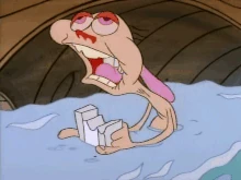
This emotion is "Fear"
Language suggesting I "just witnessed true horror" was what I thought. As usual, I ignored the rule of subtlety (less is more) in favour of the cartoony pose. Leaning as far back as possible with my legs far apart, both hands on my head, whilst screaming (I didn't actually scream, just opened my mouth) seemed to exaggerate this emotion rather well.

Here, I changed the angle of the legs, and took the hands of the head. I also really wanted to make the eyes pop out as far as they could go, without the face clipping through them. Not too different to the reference picture, however; I just manipulated Moom's body language in a manner that felt the most natural to me.

Lastly, here's "Anticipation"
This was a tough one to pull off, because I wasn't 100% clear on how to pose in a manner that suggest I'm expecting something to happen. I tried leaning forward in a way that suggests I'm looking closer at something, and put my hand to mouth in supposed intrigue.


This worked out well in the end. I added an action to the left arm so that it supports the rest of the body language, rather than just sort of hiding behind my back like in the reference photo. I kind of improvised with the eyes and eye brow, since they weren't exactly clear in the photograph. I think the facial expression compliments the entire pose very well.

Monday 3 November 2014

Modelling Skills

I've started working with Maya (3D animating/modelling software) to develop my skills beyond the traditional 2D animation software, and so far I'm finding it pretty challenging but still lots of fun. Since I'm accustomed to this yet, I was given a very simple task of making a 3D model of a truck.


I think it went pretty well. I learned a lot about Maya during the making of this. I even made an animation of this truck, just for funsies:


Next I was tasked into making another object of my choice. I tried not to go overboard with my decision (and by I overboard, I mean I was originally going to pick the Great Sword of Artorias from Dark Souls) so I settled with making a very simple coffee mug.


I think it went pretty well. This took some trial and error, of course. I find that that's a good method for me to learn about the software. It takes some time getting used to though so I did get help from others, telling me about the different tools and reminding me of what I can do. In the end, I've learned quite a bit and I'm looking to learn how to animate as well.

Thursday 8 May 2014

Title Card Development

I was just going through several ideas on how to make an interesting title card, seeing as I recently made the change that it would be placed over a splat of blood. Originally, it was just gonna be a red basic font over a black background, with the text being distorted. It turns out my change completely turned the tables and now I'm basically designing a logo for the title card. I went through multiple designs and looked at how they would fit within this border:

I couldn't think of many ideas at the time because I was short on time, but I started by sketching four potential fonts for the title:


These were concept images, that I drew to show how the letters would look. The top-left one, that I referred to as "graffiti-style" was meant to represent the gritty/edgy tone of the series, as well as go with the dark music that would play as the title card appeared. It would also appeal to the young adult crowd, aged 18-25, that enjoy the sharper and demented feel of the imagery. The bottom-left one I referred to as "Funny Games-style" because it would be used in the same manner as the film Funny Games, which filled the entire screen with giant bold and basic red font. It would just be basic Helvetica but would be sharp, to the point, and, just like in Funny Games, shock/provoke the audience when shown alongside a thrash-metal song. The top-right font, I could "surrealist", which is maybe over-exaggerating, but the idea is that it is a basic font but is stretched and distorted, to establish the themes of body-horror (taking what should be normal but stretching it's form to unusual levels to disorientate the audience). I called the bottom-right one the "Ed Fella" font because it was inspired the artist/photographer, Ed Fella, who is fascinated by bizarre typography and would alter letters to extreme levels. And I designed this font with the same ideas as the previous style in mind, taking a basic font and altering it to the extreme. It would actually be designed to resemble the character in Parasyte, Migi, and how he changes Shinichi's arm.

I then adapted these designs into a canvas, that would resemble the border I mentioned earlier. These are just rough sketches to see how the fonts would fit the border so that I could get an idea of how they would fit the transition into a fullscreen title card.


The top one I wasn't really sure of, because while it did establish the themes, whether it actually fit in front of a blood-splatter was another story, plus would it actually transition well? And the bottom one, as much as I loved the style, it just wouldn't fit. I considered having it over a black background as opposed to in front of the blood splatter, but that would have just taken too much time and taken the audience a tad too far out of the sharp and dynamic art style. Maybe if it was more stylised or simplified?


I then tried seeing how the "Funny Games" style one looked. It might have just been because the sketch was too rough but something about it just didn't sit right. While the series the sequence is for would be a comedy as well as a horror, it felt as like this stretched too far towards the comedy aspect. I looked at the graffiti style and the results kind of surprised me. The graffiti look seemed to go well with the blood and after altering the shape of the 'y' it established the body-horror aspect very well. Plus it just looks cool. I began looking at the original font for the cover of the graffic novel here, which says the title in a basic font with the 'y' tail stretched to the left, sort of going with same idea I thought with the "surrealist" and the "Ed Fella" styles. I changed the graffiti look in faith of the original font, but the 'y's longer tail would work as an under-line for the title as well. That change wouldn't have worked with the "surrealist" and "Ed Fella" styles because they were already distorted and the latter worked as well as it could because the primary letter used, the 'p', was the only one that needed to be changed.


I then tried the original font (since it's just the "Funny Games" font with the change added) and looks like it might work.

Now lastly, I made the title cards and looked at which ones worked the most. While they do look nice, only one can make the cut! I picked a green font because it is a colour code for sci-fi, and it compliments the colour red.


I ended up picking the third one because the graffiti style is just more visually appealing and transitions the most effectively with the blood-splatter and the music.

Ceramics Documentation 2

Another thing to mention about my ceramics is the task I was given to shape 12 little plasticine balls in a sequence. I took the principles of animation into consideration as I was making this, as I wanted to give the illusion of a ball transforming, even when seen in picture format; I even used the pose-to-pose approach upon making this. This was the sequence of images:


You can kind of gather that it's Lumpy Space Princess there, just to quickly get that out of the way, but I think you can see where I applied the principles of animation. Again, I used pose-to-pose, and I also used squash and stretch, as well as a technique known as settling, in which a character, after a squash/stretch, would squash and stretch very slightly before regaining their original form.; in this case, LSP's slight change in height after morphing. I focused a lot on timing and spacing, because since it's 12 frames long then it would have to be a quick but smooth transformation.

When I was done took a sequence of photographs with them: 


I then converted these into an image sequence on Quicktime (12fps):


I'd say it works pretty well, considering I didn't use Dragonframe or any other stop-motion animation software, nor have I ever made a claymation animation.