Final piece.
Friday, 15 May 2015
Lip Syncing Process

Step 1: Make a Flash document with a green background and a dot depicting where the tracking dot will be.

Step 2: Draw and animate the facial features while always covering the tracking dot.

Step 3: Open up the stop-motion scene on After Effects.


Step 4: Export the facial animation from Flash as an image sequence and import onto After Effects (make sure you change the frame-rate to your preferred fps by right-clicking and then clicking Interpret Footage). After that, you just remove the green background by changing the screen colour to the same shade of green on the Keylight menu.

Step 5: Create a Null Object and place its centre point over the tracking dot.

Step 6: Open the tracking menu, place the Track Point over the tracking dot, and edit the Motion Target to the Null Object. Then click the buttons next to Analyse and if the Track Point moves the way you want it, click apply.

Step 7: Make sure the facial features cover the tracking dot and are aligned well with the null object, and then parent the facial animation with the null object.
Final Step: Look through the footage and make sure it syncs up well, and that it covers the tracking dot the whole time, before rendering it. You can edit the path of the Track Point in the tracking menu, plus you can resize and move the facial animation but it won't affect the tracking at all.
Tuesday, 12 May 2015
Photograph for Promotional Art
We were told to produce a photograph or an image of our work be used as part of a promo for the screening of everybody's work. Grace volunteered in doing our distribution work, but this was my contribution towards it.


What Has Changed Since the Final Crit
- The original recording was changed to one sung by somebody else, as the original wasn't as energetic.
- The character design for Symphony was altered so that she would wear lipstick, since originally the mo-cap dots would show far too much whenever her mouth was closed.
- Scenes that were meant to be animated in front of a green screen had to be changed, this was not suggested during the crit, rather it was something my team decided to change soon after it, as it would have gotten in the way of other projects being made by different groups, and the lights would have been too much of a hassle to book for the stop-motion room.
- There are now going to be tints added to the characters faces.
- If there is time, we will add a silhouetted crowd in the intro and certain other bits.
- There will be credits added to the intro scene.
Final Crit Feedback
The feedback for our final crits was mainly positive. Everyone enjoyed the animation, both with the expressions and the stop-motion animation, and laughed during it. I'm really proud of my team right now actually. They told us we should maybe add a silhouetted crowd and more sound effects, but overall every one really liked it. I think giving the time constraints, we could manage to add every neat little touch that we were pitched, but there may be compromises here and there.
Monday, 11 May 2015


.jpg)


Ren's Toothache and Tone of Voice
Our team have thought about tone of voice when making this. It's mainly come natural to us, though. Grace wrote the song and I feel like the lyrics are simple and entertaining enough for a young audience to understand. I also think they are One thing I wanted to keep in mind though, was the mentality of children. Something John Kricfalusi wanted to do when making The Ren & Stimpy Show was to make a series that kids can enjoy without being educated. I kind of agree with him on that. I freaking hated being told what to do when I was a kid, and normally just cared about entertainment. That's not to say every show that focuses on morals are inherently bad. I still enjoy shows like My Little Pony, Adventure Time, and Spongebob Squarepants, that manage to have lessons while still being entertaining.
What's interesting about The Ren & Stimpy Show was that despite being very anti-moral, there was one episode called "Ren's Toothache" was actually pretty educational. It was all about how Ren hadn't brushed his teeth so now his teeth got really sore, and of course his situation only got worse from there. The story is even structured in a manner typical of a documentary animation for kids. The intro shows Ren not listening to Stimpy warning him that if he doesn't brush, his teeth will fall out, then Ren begins to suffer the consequences of that, which leads to him still being stubborn, causing the situation to get even worse for him, and eventually the problem becomes unfix-able and Ren only has himself to blame for it. This is very unlike the show to do something like this, and may have even been something the staff was forced to make by executives. Strangely enough, this episode still doesn't feel out-of-place for the series. I think the reason for this is that while it does have a moral at the end, it still manages to balance that quite well with the typical humour of the show. It's all about the tone of voice. The episode is still very zany and slapstick-driven, and it doesn't use 100% true facts either (for example, it says the toothache was caused by a tooth beaver that gnaws away at people's nerve-endings, which I don't think is based on fact), but the message is put across quite well.
It really shows that you can educate kids without being too in their face about it. It's the kind of tone of voice that John K usually tells stories with in this show, the kind that teaches morals without making kids feel like they're in school again. This is the kind of tone of voice I wanted us to go for with our music video. It was written to feel like the kind of video kids are shown in school though, but really that's even more reason to make the video with this kind of tone. So that children are both educated and genuinely entertained.
That's Organic!
I'm extremely certain that this video was what inspired my partner, Grace, to make this animation. To be honest, I do rather enjoy it. It's cute and funny, plus its tone is appropriate for the target audience of children. It's also very entertaining, slipping in a few gags here-and-there, so that it's not solely documentary-driven. The animation is pretty bad though, but I feel like that kind of adds to its silly charm. The appeal comes from the cheesy voice-acting/singing and pleasant atmosphere. It's a very fun way to teach kids about healthy eating.
Character Design - Aubrey


I was thinking for this character, I would design him as this kind of groovy, and chill, guy. I figured for his character, he could look like the more quiet one of the group, but still a rather cool guy. I actually had the California Raisins in my head when I was told by Grace that the aubergine would play the saxophone. I also thought about the Animal crossing character, Brewster, mainly for his expressionless face, complimenting his overall calm demeanor.
Character Design - Manny


Manny was designed as this cute and rather simple looking guy, but still quite a fun character. I didn't really know how to characterise an orange significantly, since it's basically just a round object, so I was admittedly rather lazy with this design. That being said, I think simply giving him that dumb smiley face establishes quite a happy character, and he still stands out from the rest of the crew. I also managed to have some fun with the expressions too.
Character Design - Larry

Since I was told this character was supposed to be a lemon, I figured I would make him stand out, and make him unique to how people would typically design a character out of a fruit like this (which I gather is a rather specific thing to think about). I figured, rather than be predictable by simply putting a face on a lemon, but work around the shape of it too. I wondered how putting a lemon on its side would help this, and naturally made the side with a stalk on it be where the face is. Afterwards, the mustache kind of reminded me of a jolly old man so I just made his eyes small and have crow's feet. I figured it would add to this personality if I didn't try and get really exaggerated with his expressions, but instead maintain this expression the whole time.
Character Design - Pepé


Pepé was designed to be this rather insane character. I figured since this was a chilli pepper I'd give him a personality that suits their typically spicy flavour, so I designed him so that he was really angry, or at least very excitable.
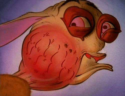
Character Design - Symphony


This character was designed with generally rather cute facial features. I wanted to go for a face that's cute but still very expressive, so that her facial animation can be entertaining to look at. I also really wanted more than just her face to be different but her general appearance to be unique to the other characters. Obviously, she automatically would look different to them, since she's... you know, a strawberry and all... but I wanted little details such as her stalk to have it's own idle position that differs from the rest, and the way in which her leaves are arranged to be different, also.
Wednesday, 6 May 2015
Oli Animation
I discovered this animator on Youtube with a channel simply called "Oli". What he does is very similar to what I'm doing, putting 2D facial expressions in front of a 3D model. The way he does facial expressions is incredibly good, pulling off some spumco-esque facial expressions that really push them to the extreme. I started thinking about this more when drawing the storyboards and animatic, trying to push the expressions a lot more. I love exaggeration a lot so I'm glad this made me think about it even more, when working in this manner.
Monday, 20 April 2015
Summative Evaluation
This module introduced me to some very interesting ideas
regarding key aspects of animation, such as collaboration and pitching, and
these are aspects I had never even considered before. There is also the value
of gaining exposure by doing outside briefs in my own time that I learned about
through the work I’ve done here.
The work I
managed to do for my individual practice was great for self-improvement,
exposure, and other valuable aspects that could benefit me as an animator. My Syfy brief, while I did decide not to
submit it, I learned how to plan and create pitch boards, something I initially
had a tough time understanding the importance of, and is one of the most useful
skills to know in the long run. Upon being introduced to YCN briefs, like the
Syfy one, I learned more about why those competition briefs are on YCN, since
they are failing and need something creative and eye-catching to support
themselves. This is a good method of gaining exposure, and adding to my portfolio,
by following these types of briefs. This study task also made me consider how
to respond to a target audience, as well as how to recognise genre signifiers
through mise-en-scene and colour, and both of these are important elements to
master, since I’m an aspiring storyteller as well as an animator.
I also managed to develop my skills at posing, character
design, and illustration by doing a bunch of t-shirt designs for the website,
Qwertee. I mainly made designs based on popular video games and cartoons, since
fan-shirts are the most famous ones of all on that site and therefore more
likely to win. I was able to experiment by using other people’s art styles and
seeing how my style and method of drawing translates with professionally
designed characters. I feel like my skills at drawing have increased because of
that. The poses, specifically for the “Gravity Souls” Qwertee design, came out
looking great. The character design skills developed even more, after drawing
professionally designed cartoon characters, because I picked up how and why
those designs worked in the first place.
I also
looked at a website called Loop de Loop, which posts briefs in which I have to
make animations that loop and relate to a given theme, in my case the theme was
‘Gravity’, for example, and they let people be as creative as possible with
their themes. The theme of gravity was a rather tough one to look at, so I
figured rather than plan ahead for it, I could just keep on animating and see
what I come up with as I go, which did actually lead to a bunch of surprises. I
made some very nice looking expressions that transitioned very fast yet
smoothly between each other. If I had refined it a little more then it could
have actually managed to be accepted for submission. I had to make something
for 11-second club as well, though. I actually used some of the skills I
learned from the Qwertee designs and a little bit from Loop de Loop as well, to
make a little something just to get my mind back to animation for a bit. I
actually think if I did any more animations for this website, then I could
actually build up my portfolio a lot, as well promote myself.
As well as
my individual practice, I was given the task of collaborating with someone. As
an animator, teamwork and leadership is an important trait to have, and I
believe my partner, and I, both worked well enough together to create some very
decent work. We were both loyal and understanding enough towards each other to
know each of our roles and responsibilities. I genuinely enjoyed working with
her as well. We were both had the same thoughts and opinions on our work, and
what we could gain out of it. I learned more about creating pitch boards and
presentation, and we both managed to work like professionals with our work when
we were presenting it. We also both tried a more darker and bleak approach to
animation, something we both have not done before, that is to say, and I
personally have not done something like that in a serious manner before. I
actually did this because my partner recognised my rather dark imagination and
wanted to work around that, so I’m glad I was able to respond to that.
Overall, while
this module did give me a lot of opportunities to learn new things that could
be applied to animation, I just wish I wasn’t forced to lessen my time spent on
other modules in order to work on this, as the workload was crazy. It certainly
wasn’t as engaging as the main subjects, and while I did make my work relate to
animation, it was still more geared towards stepping away from that, since
animation is such a long process it was often recommended against that. All
that is especially considering all of these skills were much better handled in
PPP and Applied Animation.
Sunday, 12 April 2015
Syfy Brief - The Final Pitch Boards


I took a lot of feedback to heart and made some necessary changes to these pitch boards. There were complaints that they weren't clear enough and that there were no mock-ups. Overall, people were generally quite positive towards this but felt they needed improving. So these are my final pitch boards, and I think they work great. I didn't submit them, however, because I was so focused on other things that these were kind of neglected. I also didn't have the money to submit them either. It was just one stressful thing after another. On the bright side, though, I am quite proud of how they turned out in the end. Plus I did learn a lot from this experience. I'm just glad it's over though.
Loop de Loop: 'Gravity'
The theme for Loop de Loop at February and March was 'Gravity', which I wasn't really all that sure about. Seemed like a rather vague theme for animation, honestly. But for the sake of the my little animator bug that's been slowly dying in my mind for the past few months, I had to at least go for it. I admit, I was kind of lacking in ideas for this. After a while, I decided to experiment, by opening Flash and just keep going as I went along, then see where it takes me. So I just drew a generic stick-figure and started animating. Pretty straight-forward. I was kind of surprised with the results actually. It ran quite smoothly, though that's not to say it wasn't difficult and time-consuming like animation usually is, and I had fun with the expressions of the character. It fit the theme and looped quite well too. It's not perfect though, and I guess that's why it wasn't accepted for submission.
So this was decent practice for character animation, and straight ahead animation, something I've never tried before. Maybe in the future I can try it and it'll make it in.
So this was decent practice for character animation, and straight ahead animation, something I've never tried before. Maybe in the future I can try it and it'll make it in.
Saturday, 11 April 2015
11 Second Club: March
So *sigh* this friggin' website sure led to a series of blunders for me. I was going to do November's but I started way into the month and couldn't finish it in time, then I tried again on January, but then I lost all my save data (and again, this was way into the month so I couldn't start again), then finally I got to do the one for March! This time I completed it though, and boy am I happy!
As I am highly interested in character animation, and wish to practice that (and not to mention we haven't actually animated in a while) this was a great opportunity to really develop my skills in that field a lot more. I didn't actually target an audience for this one, though it might stifle my creativity if I did. That's not really the idea behind 11 second club anyway. The art style was a lot more expressive here, and I wanted each pose to be really unique. I also wanted the poses and animations to be really exaggerated to make it more interesting and humourous. Enough talk though, here's the video!
It actually did really well! Surprisingly well, for a first time. It just about scraped the top 50, taking the 53/228. JEEZ. If I keep this up I could eventually make it to at least the top 10.
Qwertee Design: 'Artorias Time'
Another Dark Souls mashup, this time with Adventure Time. I really like Dark Souls okay? This was another idea I had in order to appeal to a larger fanbase. It's based on one of the many hidden details within Dark Soul's lore, in which a Knight named Artorias had a Wolf friend named Sif, until Artorias got consumed by the abyss (I'll stop there because now I sound crazy). I figured a mashup like this would grab people that know the lore of Dark Souls and would get what this is referencing. And of course they might even get the humour of it, taking what is a pretty depressing story and mashing it up with the one of most uplifting duos on TV. I actually got told by someone that they would wear this design if it was a shirt, so clearly I've improved quite a bit, ever since I started making Qwertee designs.
This is what I made:

I think I've learned more than I originally planned from doing Qwertee designs. They're certainly harder and more time-consuming to master than I initially thought! I might make more in the future. I'm pretty satisfied with what I've got, now back to animating (something I haven't done in far too long)!
This is what I made:
I think I've learned more than I originally planned from doing Qwertee designs. They're certainly harder and more time-consuming to master than I initially thought! I might make more in the future. I'm pretty satisfied with what I've got, now back to animating (something I haven't done in far too long)!
Qwertee Design: 'Gravity Souls'
For this design, I figured I would try creating a mash-up of two franchises that I enjoy a lot, Dark Souls and Gravity Falls. This may be limiting the target audience to a very select group of people, folks that enjoy both Dark Souls and Gravity Falls together, and that might be a relatively small audience. I didn't mind, though. I just really enjoyed the idea. The cool thing about Qwertee is that they give you a lot of creative freedom with the designs; even if they might not get a lot of votes, they are still worth doing regardless of that. Anyway, I thought I'd create this to see if I could capture the art style of someone else, seeing how it translates with my style, and establishing scenarios in a single image, which I think is a really important method of practicing visual storytelling.
Here it is:

I actually really enjoyed making this! It was a good way to practice different poses, and I think I captured the character's emotions and personalities through body-language perfectly. The scenario presented is clear and, I think, portrays how it would go if it happened in Gravity Falls. I think the Black Knight is well stylised (though I wish I could have made him taller). I think where I fall flat is the background art, though. In case you can't tell, the setting is supposed to be a specific room in Dark Souls in a location called "Undead Burg", but it's not very clear, since I didn't do a great job at colouring it. I might go back to this and resubmit it in the future, since I think that is where the potential could lie. I just have to get good at drawing backgrounds... Oh and you can tell right away that I definitely spent more time on this than I did that crappy Psycho Mantis design.
Here it is:
I actually really enjoyed making this! It was a good way to practice different poses, and I think I captured the character's emotions and personalities through body-language perfectly. The scenario presented is clear and, I think, portrays how it would go if it happened in Gravity Falls. I think the Black Knight is well stylised (though I wish I could have made him taller). I think where I fall flat is the background art, though. In case you can't tell, the setting is supposed to be a specific room in Dark Souls in a location called "Undead Burg", but it's not very clear, since I didn't do a great job at colouring it. I might go back to this and resubmit it in the future, since I think that is where the potential could lie. I just have to get good at drawing backgrounds... Oh and you can tell right away that I definitely spent more time on this than I did that crappy Psycho Mantis design.
Qwertee Design: 'Psycho Mantis Reads Your Memories'
For this design, I wanted to develop my new shading technique a lot more, and really wanted to base it on Metal Gear Solid, having only just played it for the first time ever, at the time. Although this time, I tried to work extra fast. Unlike the "Ren is Angry" design, this took a lot less planning and I basically spent an afternoon or less on it. The idea was to parody a rather notorious scene in the game in which the villain, Psycho Mantis, reads the memory card in the Playstation and talks about which games the player enjoys, only instead he's saying "you like Metal Gear Solid, don't you?".

It wasn't... terrible (I love how I drew the hands, actually), but it wasn't great either. As I said, I thought I could rush this design, assuming a t-shirt was basically something you could easily accomplish in less than a day, but as it turns out it still requires a decent amount of effort. It brought to mind my past errors of rushing a lot of my character designs and pre-development work, rather than actually spending time on them. Oh well, next time, I'll actually work much harder on them, like with my Ren is Angry design (I actually spent more time on that than I did with this).
Rule Britannia Ident Completion/Submission
After a slightly hellish week of doing nothing for this ident, due to my partner's unfortunate illness, we both managed to pull through and get this finished in time for submission. I had to spend a rather hectic weekend finishing the damn thing (as I had to spend time with my family the weekend it was due and I hadn't even started animating it, plus there was no audio! And it had to be done on After Effects, the most unstable glass cannon software on my computer) but I still managed. In order to create the audio, I basically sampled different pieces of the existing ident music (and it sounded pretty damn good when it was slowed down) and also used audio samples of the showreel they gave out. I had no means to create music, so I tried experimenting a little. It was a form of sampling inspired by the video game, Earthbound's soundtrack.


It turned out okay, not a complete mess, but I feel like the chaotic nature of the audio I created fit perfectly with the gritty tone of the ident.
I also took the characters Fiona drew and converted them puppets on After Effects. The process of converting them puppets and animating them actually went quite smoothly. A simple process on After Effects actually went smoothly! Shocking right? I also used some green-screening to add the showreel footage to the TV in the ident. Well, here's what was made in the end!
Now, unfortunately, since I this finished a night before the deadline day, my partner had a pretty tough time submitting this because the website was lagging like crazy, as it usually does on deadline day. Makes me think: Are there other universities out there with the exact same module as us that stressed people out so much that they couldn't finish the work early maybe? Anyway, here's how the process went, as Fiona screen-grabbed it.
Starting out okay. Basically just wrote the summary that was on the pitch board.
And two hours later, she makes it to page two!
After much heartache, she manages to upload it 101%!... Wait wut?
Okay that's better! Man, this site gets screwy when you submit it too late.
Okay, finally the thing is submitted and paid for! *exhausted exhale*
And that's it for that brief! It was a long and treacherous road, and we both learned a lot from this, but booooooooyyyyyy am I glad it's over.
Thursday, 5 March 2015
Ident Presentation and Feedback
We recently made presentation pitch boards about the ident we're making for Vice, and a lot of people left some helpful feedback, and I'm currently going over the feedback people left and choosing which notes I will consider. Here are the pitch boards we showed, in no particular order:


We got a lot of interesting feedback regarding the ident itself. Sort of mixed overall though. Some people liked it overall whereas some were more critical. One person listed a few suggestions for animation style, and illustrations to look at. I'm open to a few of them, but others I'm not quite sure. For animation styles, they mentioned Ed, Edd, & Eddy, which I guess the show's constant movement is what they're referring to, and I think that could fit in. Joanna Quinn was also suggested, and after looking at her work, I really think it could work as an aesthetic influence but in terms of animation style, I think something like that could only be accomplished using hand-drawn animation, which I wasn't planning on doing. Terry Gilliam was mentioned to, and thinking about how I plan on animating it, I suppose it is very similar to Terry Gilliam's style, just less comedic.The Young Ones opening was suggested too, and I don't really know what to make of that, I mean it's not animated for one thing, it's not really that well-edited either and the style is inherently comedic, so I'm not really sure where they're coming from with that. Ralph Bakshi's animation is rather similar to Joanna Quinn's, with the gritty look. How the city and the backgrounds are drawn in his films could be incorporated into the ident, but again, as this won't be hand-drawn, the animation style couldn't possibly be accomplished.
For the illustrative style, we were compared to punk anarchist, in terms of character design, and I guess that's what Fiona was going for. I think it works, anyway. We were also compared to the Red Bull adverts, as well as Ralph Steadman (if I knew who said that I would totally shake the hell out of their hands!). We were also told to look at Raymond Brigg's Falklands (which I can't seem to find on Google, so I'm just going to assume it's alternate title to When the Wind Blows), which I think works as reference for more gritty tones in animation, but I don't think the imagery is quite that surreal enough to fit. They suggested the Silent Hill comics as well, and I'm not a big comic book fan, but it's interesting to see how the art style of the games translates to comic book form so I'll look into those... Unless they mean the bad Silent Hill comics, that go waaaayyy overboard with their bleak colour pallet.

Ronald Searle was suggested too, and it's a neat art style, but a tad comical, really. Someone mentioned GTA Vice City as a suggestion, and while I do love the graphic novel-esque illustrations, it's far too colourful to incorporate into the ident. But then again, I might try that look out for the Union Jack Sword man, since I'm kind of going for an uncanny valley feel with his design. Speaking of which, a lot of people didn't catch on at all that he was holding a knife. I didn't use a real knife for reference when I designed it so it's no wonder people were confused. It actually looks more like a club than a knife. I'm redesigning it based on a bowie hunting knife now, but still, how I even tried to pass that off as a knife to begin with is beyond me.
Lastly, the rest of the feedback was on the presentation, being filled with too much text, and I agree with that, it should definitely just go straight to the point and present it more visually. The feedback was pretty useful so far. I was going to add a mock-up to the boards as well.
We got a lot of interesting feedback regarding the ident itself. Sort of mixed overall though. Some people liked it overall whereas some were more critical. One person listed a few suggestions for animation style, and illustrations to look at. I'm open to a few of them, but others I'm not quite sure. For animation styles, they mentioned Ed, Edd, & Eddy, which I guess the show's constant movement is what they're referring to, and I think that could fit in. Joanna Quinn was also suggested, and after looking at her work, I really think it could work as an aesthetic influence but in terms of animation style, I think something like that could only be accomplished using hand-drawn animation, which I wasn't planning on doing. Terry Gilliam was mentioned to, and thinking about how I plan on animating it, I suppose it is very similar to Terry Gilliam's style, just less comedic.The Young Ones opening was suggested too, and I don't really know what to make of that, I mean it's not animated for one thing, it's not really that well-edited either and the style is inherently comedic, so I'm not really sure where they're coming from with that. Ralph Bakshi's animation is rather similar to Joanna Quinn's, with the gritty look. How the city and the backgrounds are drawn in his films could be incorporated into the ident, but again, as this won't be hand-drawn, the animation style couldn't possibly be accomplished.
For the illustrative style, we were compared to punk anarchist, in terms of character design, and I guess that's what Fiona was going for. I think it works, anyway. We were also compared to the Red Bull adverts, as well as Ralph Steadman (if I knew who said that I would totally shake the hell out of their hands!). We were also told to look at Raymond Brigg's Falklands (which I can't seem to find on Google, so I'm just going to assume it's alternate title to When the Wind Blows), which I think works as reference for more gritty tones in animation, but I don't think the imagery is quite that surreal enough to fit. They suggested the Silent Hill comics as well, and I'm not a big comic book fan, but it's interesting to see how the art style of the games translates to comic book form so I'll look into those... Unless they mean the bad Silent Hill comics, that go waaaayyy overboard with their bleak colour pallet.
Ugh... This looks worse than Silent Hill: Homecoming. I'll be sure to warn Fiona about these comics
Ronald Searle was suggested too, and it's a neat art style, but a tad comical, really. Someone mentioned GTA Vice City as a suggestion, and while I do love the graphic novel-esque illustrations, it's far too colourful to incorporate into the ident. But then again, I might try that look out for the Union Jack Sword man, since I'm kind of going for an uncanny valley feel with his design. Speaking of which, a lot of people didn't catch on at all that he was holding a knife. I didn't use a real knife for reference when I designed it so it's no wonder people were confused. It actually looks more like a club than a knife. I'm redesigning it based on a bowie hunting knife now, but still, how I even tried to pass that off as a knife to begin with is beyond me.
Lastly, the rest of the feedback was on the presentation, being filled with too much text, and I agree with that, it should definitely just go straight to the point and present it more visually. The feedback was pretty useful so far. I was going to add a mock-up to the boards as well.
Subscribe to:
Comments (Atom)