One thing's for sure, I should always remember one huge key thing. Simplicity. As much as you might want to deny it, it is a fact that simple looking images are far more appealing to the brain than huge and complex images. This usually refers to images comprised of solid colours, simple shapes, and a distinct lack of realism. As an example of this, here are screenshots of two animes with entirely different styles, one very simple and the other more detailed:


Most likely, your eyes were drawn to the latter image, despite being slightly smaller and lower down than the first image. It automatically stands out more because of its vibrant solid colours, and dynamic lines. The first image is more dull and realistic, which your eye is instantly drawn away from.
Ironically, though, images can actually be too simple, and it instead becomes unappealing. Creating simple images is one thing, but an important key factor is that it needs to come to life, still be well-drawn, and contain at least SOME semblance of realism. I'm going take one of the 12 principles of animation as an example, as it applies to art in general. The principle known as "Solid Drawing" describes images that give people a sense of solidity, as the name suggests, depending on how it is drawn. This is done by drawing an image as if it was a three-dimensional object, rather than a simple 2D image on a canvas.
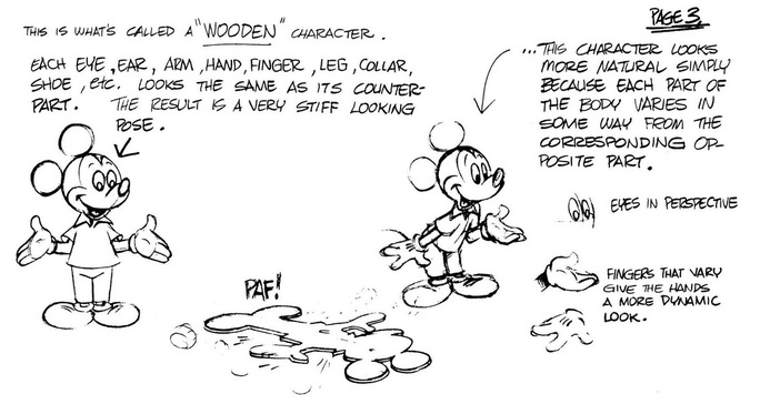
This image, taken from The Simpsons Handbook by Matt Groening, explains why a 2D image looks really bad without the solid drawing principle in mind. If the character appears to exist in a 3D plain, it just automatically looks better.

I made this image to describe in my own words this concept. Perhaps I've gone into detail a bit too much, but this is important for people working mainly in 2D, like me.
Now with all that said, how does this apply to my target audience exactly? Well, quite a bit actually. The target audience is fairly young, for starters, which means their minds are still at the development stage, so simple 2D images would look especially appealing to them. Since they are sci-fi fans as well, I should also apply this entire concept with the genre signifiers that I mentioned in a previous post.
No comments:
Post a Comment