Wednesday 31 December 2014

Exaggeration in 3D Animation

If there is one thing I love to see and do is exaggeration. I think exaggeration adds a lot to a scene in animation, because it makes every motion in the scene so much more engaging and imaginative. I particularly love in kid's shows like Spongebob and Ren & Stimpy when they really have fun with the art style by pushing the flexibility of their characters.


These two shows manage take something as simple as eating and make it look interesting and hilarious, just by exaggerating it. That's why I love animation like this, because they really know how to go off-model. I can accept weird stuff like Ren's mouth and head changing size and shape like that, and Spongebob's tongue and left arm stretching to those disproportionate lengths because the transitions and the motions feel natural with the animation.

This is the benefit to animating in 2D as opposed to 3D, because you can be much more loose like that in 2D. With 3D, it can be really difficult to pull off a style like this, without completely destroying the 3D model in the process, being really good at making 3D character models, or, if you're really desperate, making multiple 3D models of the same character (though I highly doubt anybody's THAT crazy).

Though, that's not to say it's impossible. Films like Hotel Transylvania and TV shows like Teenage Mutant Ninja Turtles are brilliant at exaggeration, for example.


With that said, though, it is clear that a lot of skill and effort is put into making 3D animation stretch like this, the problem for me is that it doesn't really translate as well with 3D as it does 2D animation. The transitions are hella smooth and the emotions are well-acted in the examples shown above, but I just think this style was always meant for 2D, and there's probably more reason that to wonder about why this style is rare to find for 3D animation.

Working with Dope Sheets

I was introduced to dope sheets the other week, which are basically plans on where and when to place the audio within a frame of animation. It is particularly useful for lip syncing in character animation, during scenes that require dialogue. To be honest, I'd learned about dope sheets a while ago from the Animator's Survival Kit, and they looked just as terrifying then as they did this time. Granted, I have learned to get used to them, since I was given a very simple dope sheet that was rather easy to get into. I can actually get behind using dope sheets more often in the future, because I found it way easier to lip sync this way. It would also be useful to animating in general, really, especially overlapping and secondary actions.

Using the dope sheets I was given, I was able to practice lip syncing on Maya. I made this video with the phonemes and audio I was given:


Cinematography References: Film Noir

Having studied the sub-genre, film noir, I have always enjoyed the many different methods that are associated with film noir, due to the typical nature of the camera work, lighting, and use of shadow. I've always thought the appeal of black-and-white stems from the amount of effort put into cinematography, because film noirs tend to succeed at being visually unique and brilliant despite the lack of colour. Speaking, of course, on behalf of classic film noir, which, by focusing attention on all the other aspects of cinematography, managed to encourage very creative ways to depict black-and-white film, giving the genre a unique and unforgettable look.

My favourite technique used in film is definitely the dutch tilt, because of how well it depicts the dread of a scene, usually from a character's perspective. It seems to have a lot of uses, but it is mainly used for adding a sinister touch to the scene.


See what I mean? I look at these images and just feel the intensity, simply from the cinematography. The shadows, the camera angles, the low key lighting, are all the reasons I just love this genre and why it influences me. This was one of the reasons I changed the style of my animation to match this style, because of how effectively it conveys the tone, and it translates well into animation.

Sunday 28 December 2014

A Change in Style

This happens quite rarely for me, when I get a sudden need to change the art style of something I'm in the middle of creating, but when it happens, it always leads to fantastic results. This time is no exception. I was in the middle of creating the set for my 3D animation, and I was trying to create the colours for the walls. I was also going to include all the little details, such as window frames, floor textures, etc. Suddenly, as I looked at it with the solid grey-scale colours, I noticed it actually looked pretty darn effective the way it was, considering the themes of the animation.

This is how it was originally designed:


There's a lot of detail and several props here. Everything would have been mostly symmetrical and realistically coloured, with dark blue lighting.

This is how it looks now (with extra lighting added so that you can make it out):


It works extremely well the way it is now, I find. The simple look makes the distortion translate very well. I'm using a camera with the Lens Squeeze ratio set to 3, since the set is rather small, and how it distorts the setting gives the solid textures more character. It also fits the rather comically bleak tone I was going for, because the bleak colours and over-the-top distortion fits the theme of broken mentality, and the comedic tone. This style also automatically draws the eye towards Moom, since he's the only coloured model, and the distorted imagery fits his emotions and current state of mind. The shadows also stand out pretty well and look fantastic, since shadows are symbolic of a darker side I really wanted them to be emphasised in exactly this manner.

I'm glad I chose to stick with this style. It actually has kind of the same effect as the video game Killer 7, which used a very similar style, which added a lot to the game's dark and surreal tone:

Monday 22 December 2014

Frame Rates in 3D vs 2D

This is a rather obvious difference between 2D and 3D animation. It is far more easy to animate at an incredibly high frame rate with 3D, because the actual process of animating involves mainly tweening, whereas with 2D is mostly drawing, and depending on what software is used for 2D, can involve tweening but too much of it would lessen the quality of the animation. The average frame rate for 3D animation is 24-30 fps, but occasionally, specifically with video games, the frame rate will reach heights such as 60 fps, or even 144 fps! No 2D animator would ever be crazy enough to attempt such high frame rates. There would be no point, since 2D animation will look smooth enough without a high frame rate, because due to the simple and solid look of it, it'll give the illusion of smoothness; that's why in Japan they can get away with animating 2D at a mere 8-12 fps. I personally adore high frame rates in animation, because they just give the animation a lot of character, and adds a unique quality to the technique that makes it stands out among every other technique of film and TV. Just look at this footage of Resident Evil Remastered, for example.


Even though the art style is realistic, the high frame rate makes it look very appealing and separates it from the more standard 3D animations of that style that are animated at the average 30fps to look more "cinematic".

Tuesday 9 December 2014

Acting Reference: The Joker

The Joker has a number of interpretations by different actors that usually work well in their own right. Some of the most famous examples are Cesar Romero, Jack Nicholson, Mark Hamill, and Heath Ledger. These are normally the first versions of the Joker that people tend to think of, because of how much they stand out on their own.

Cesar Romero's Joker, from the Batman 1966 series.

Due to the rather silly nature of the Batman 1966 series, Cesar Romero's performance is incredibly goofy and over-the-top, to the point where he is not even the least bit scary. That's the idea, though, to perform the villain as more of a silly character than a typical threat. This portrayal actually fits the tone of this series very well, and there's no denying that it is fun to watch.

Jack Nicholson's Joker, from Tim Burton's Batman (1989)
Tim Burton's adaptation of Batman was famous for taking the story in a much darker and edgier direction, because he felt it was more fitting for the portrayal of Batman. This didn't change the lack of subtly to the story too much, though, and this was reflected by Jack Nicholson's performance as Joker. He essentially does what Malcolm McDowell does with Alex DeLarge, which is establish the character's insanity whilst still portraying them in both a charismatic and frightening manner. Nicholson portrays Joker effectively by combining the silliness of Cesar Romero's performance with his own intense acting style, and it works very well with the universe of this film and makes Joker both loveable and terrifying.

Mark Hamill's Joker, from Batman: The Animated Series (1992-1995)
Mark Hamill, at the time known more for the Star Wars franchise, pulls off a surprisingly great performance as Joker. He is performed with such a great amount of glee and craziness that it creates a perfect contrast between his very over-the-top, light-hearted attitude, and his scary lust for chaos (and this show was not above adding a few murders here and there), it also helps that every scene and episode about him is essentially tailor-made to be as depraved as he is. Mark Hamill was apparently known well by the other voice actors for being the only one to act with his whole body, because his character was the most charismatic of them all, and Mark Hamill would stand up and do insane gestures in order to maintain that high amount of energy. It effectively makes his version of Joker one of the most memorable one of all.

Heath Ledger's Joker, from Christopher Nolan's The Dark Knight (2008)
This is easily the most memorable Joker of all time, and with good reason too. Heath Ledger portrayed Joker as someone who sees true order as disorder, and he is empowered both this ideal, as well as his lack of morals, his sheer joy and charisma, and his insanity. The performance perfectly establishes this idea. Since Chris Nolan was taking Batman in a much deeper direction than usual, Heath Ledger essentially uses this as an opportunity to give a much fresher take on the character, and he plays it so perfectly that even for a second I forget that I'm watching an actor play Joker and instead feel like I'm watching a real-life Joker.

Cinematography in 3D


I want talk about cinematography for a bit. I consider myself a huge fan of that side of production. I absolutely adore visual mediums that have great lighting/shadow, camera work, and every other aspect of cinematography. It is something I hold near and dear to me. This is one aspect I can easily favour about 3D animation over 2D. When animating in 3D, I am basically in charge of every aspect of cinematography during the animation process. The problem with 2D animation is that I don't have as much free reign over everything. I kind of enjoy physically moving the camera myself more than drawing the shot on a layout sheet; plus lighting and colours are normally sorted out during post production, rather than production like stop-motion, 3D, and live-action; certain parts of the cinematography are usually fixed during post-production with those mediums, though not to the same extent as 2D animation. Of course, the look of the scene in the end is all that matters, really.

3D animation is just more engaging in the cinematography aspect, because it's closer to how it works in reality, where you are creating the stage, setting up the lights, and moving the camera to where it needs to be. I plan on taking full advantage of this in my animation. I am actually mainly influenced by live-action films in terms of this, because I believe their imagery, while adapted to live-action, can be applied to animation. So I will try and look at both animated and live-action examples of good cinematography.

My Syfy Brief

I wrote down what I plan on creating for the Syfy brief in this sheet in my own words, so that you could get a better understanding on what I plan to create.


This isn't exactly a finalised brief; depends if it's straight-forward enough or that I have the right idea about what I want to do. I might lower the frame rate a tad. While I am planning on using short little tweens for the animation, that would move very smoothly, it might change over time to frame-by-frame animation, simply because it has it's own appeal, and I might enjoy it a lot more.

Responding to my Target Audience: Imagery

I was wondering what sort of imagery is actually appealing to my target audience. By that I mean, what colours, symbolism, and art style will grab their attention? I thought a lot about this, since this is a key aspect for my brief, and, as an animator, I should always be thinking about everything visually. So what sort of imagery actually appeals to my target audience?

One thing's for sure, I should always remember one huge key thing. Simplicity. As much as you might want to deny it, it is a fact that simple looking images are far more appealing to the brain than huge and complex images. This usually refers to images comprised of solid colours, simple shapes, and a distinct lack of realism. As an example of this, here are screenshots of two animes with entirely different styles, one very simple and the other more detailed:


Most likely, your eyes were drawn to the latter image, despite being slightly smaller and lower down than the first image. It automatically stands out more because of its vibrant solid colours, and dynamic lines. The first image is more dull and realistic, which your eye is instantly drawn away from.

Ironically, though, images can actually be too simple, and it instead becomes unappealing. Creating simple images is one thing, but an important key factor is that it needs to come to life, still be well-drawn, and contain at least SOME semblance of realism. I'm going take one of the 12 principles of animation as an example, as it applies to art in general. The principle known as "Solid Drawing" describes images that give people a sense of solidity, as the name suggests, depending on how it is drawn. This is done by drawing an image as if it was a three-dimensional object, rather than a simple 2D image on a canvas.


This image, taken from The Simpsons Handbook by Matt Groening, explains why a 2D image looks really bad without the solid drawing principle in mind. If the character appears to exist in a 3D plain, it just automatically looks better. 

I made this image to describe in my own words this concept. Perhaps I've gone into detail a bit too much, but this is important for people working mainly in 2D, like me.

Now with all that said, how does this apply to my target audience exactly? Well, quite a bit actually. The target audience is fairly young, for starters, which means their minds are still at the development stage, so simple 2D images would look especially appealing to them. Since they are sci-fi fans as well, I should also apply this entire concept with the genre signifiers that I mentioned in a previous post.

Monday 8 December 2014

Responding to my Target Audience: Genre Signifiers

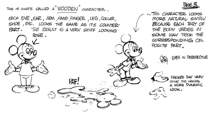
Colour actually plays an important role in this as well. An audience searching for a specific genre will likely find a specific colour that comes along with it. They are just one of many genre signifiers. All genres for visual mediums are given key signifiers that represent what type of medium audiences are consuming. In fact, that's literally the definition of a genre. It is one of many aspects of human nature we take for granted, the need to simplify/label everything so that it instantly makes sense to us. Though, what is a genre signifier? Everybody should know already, but haven't quite thought about it yet. A genre signifier is one aspect of any given genre that defines it.

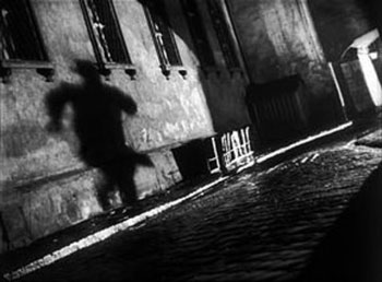
A genre signifier for any visual medium would be a specific type of mise-en-scene that would normally be associated with that medium. A horror movie, for example, would normally contain very dark and bleak colours (usually red, because of the association with blood and danger, and black, because of its association with the dark), threatening monsters, and very serious, edgy, subtle body language (from human characters). A comedy, on the other hand, depending on what type of comedy it would be, would use more vibrant colours, exaggerated body language, and typically a real-world setting. A comedy and horror hybrid would combine these two types of images, exaggerating the red and black colours (whilst also making them more vibrant), using threatening monsters but depicting them in a comedic manner, and using human characters with exaggerated scares and body language.

In order to appeal to sci-fi fans, I will look at whatever visual genre signifiers I can find.

Colours: Usually, a sci-fi will emphasise heavily on blue colours, since the blue will remind audiences of space and high tech. Green is typically used for sci-fi films about aliens, because those two are things that people will associate with each other, despite aliens rather rarely being depicted as green. White is usually used for sci-fi films set in a futuristic utopia, brown and grey for apocalyptic future settings, and black and dark blue for dystopian future settings.

Mise en Scene: High tech machines and objects are normally used for sci-fi films. The clothing of a character would either be a funky looking uniform for a space crew, or some bizarre outfit as a futuristic fashion choice. If the film is about monsters, they wouldn't be supernatural creatures/myths like vampires, werewolves, etc., they would normally be some kind of mutated version of existing creatures, usually insects, sea creatures, and reptiles (and at one point, clowns). The marketing of the films, if they were targeted towards men, would normally depict a nameless scantily clad woman in danger (normally in the 50s but occasionally nowadays as well).

Non-verbal Communication: Mainly in a marketing standpoint, a sci-fi poster would usually show a character brandishing a laser gun, or any kind of high tech weapon, within the poster of an action/sci-fi. A sci-fi monster movie would either show the monster in a threatening pose or fighting another monster, both of which next to a skyscraper in a city to emphasise scale. There would also be a group of the main characters looking in terror at the monsters. The poster of a film set in the future would usually show a character looking up, presumably at the world around them, with a stunned expression on their face, to establish the spectacle of this world. In a dystopian future, the narrative is more bleak so there wouldn't be as much focus an the characters' entire bodies, just their serious facial expressions, and possibly a weapon they have held in front of their faces.

Responding to my Target Audience: Overview

The brief I have chosen for Responsive describes their target audience simply as "18-25 year old sci-fi fans". They obviously make it sound like a simple audience because if they went onto full detail about their target audience, it would be too overwhelming for people if they looked at "Target Audience" and saw a huge essay about several groups of people. I can see where they are coming from, though, even with that vague description. Very quickly, though, I'm going to take a look at two key target audience types:

Primary Audience: This describes the audience a product would focus on, mainly; that would mean adapting a product or content that fits the needs of a very specific group of people.

Secondary Audience: An audience a product would appeal to without even trying to. This could be due to said audience being related in some way to the primary audience of a type of product or content; for example, parents watching a kid's show with their children would be said kid's show's secondary audience, while the kids are the primary audience.

This relates heavily to how I plan on appealing to my target audience, so I'm going to try and translate what Syfy calls "18-25 year old sci-fi fans" into something more literal. I'm going to apply more audience theory into this, but I won't explain things like "Segmenting Psychographics" or even just the aspects like "The 4 Cs" and "Social Classes" or else we're gonna be here forever, so I'm going to describe what I think Syfy's target audience comprise of, with reference to "Segmenting Psychographics".

When I think of 18-25 year old sci-fi fans, within the context of this brief, I immediately think of huge nerds, like me; to be specific, I think of people who are fans of TV, cinema, and anime; typically follow the action, comedy, horror, and fantasy (as well as sci-fi, obviously), and are particularly into cheesy cult films. I don't have a specific race or gender in mind, and let's keep it that way! I have nothing against appealing to this audience. I actually think they have the right idea, too.

Of course, that's only the tip of the ice berg, I want to go way deeper now. Potential secondary audiences could be audiences between the ages 7-13 years old, watching these shows with an older sibling or even their parents. I, personally, watched shows like Buffy and Angel rather religiously when I was at least nine years old, so there's no denying this. Not only that, but children generally have an interest in shows or movies considered too mature for them. The more mainstream audiences, fans of more popular stuff from Syfy's competing networks (Channel 4, E4, ITV 1 & 2, etc.) could find something appealing about the Syfy channel, too. Thanks to shows like The Big Bang Theory, Parks & Recreation, and other shows/movies with "typical nerd" character types, "geek culture" is more mainstream nowadays, so it might appeal to fans of more popular TV and Film. A more mature audience of 35 years and up might even find this channel appealing as well, since these are the type of people who may get a sense of relaxation from watching cheesy cult shows/movies, since people that age normally go through everyday stress from work and seek comfort from the TV they watch, so they wouldn't really want something that would make them "think" too much.


Monday 1 December 2014

Acting Reference: John Kricfalusi as Ren Hoek

A somewhat more relevant example, since it is voice-acting. I didn't want to look at only voice-acting, because I feel that being able to act in general is more beneficial than just being able to voice-act. To put it simply, a good actor is one that act in any environment, whether that's a film set, a theatre production, or a sound booth to record voices. With that said, I wanted to look at who I feel is a perfect example of an insane character performed with such a high level of bliss and over-the-top madness, and makes it both creepy and hilarious. Ren Hoek, from The Ren & Stimpy Show, is a rather notorious character, particularly, and rather ironically, for more grown-up audiences because he is one of the most depraved cartoon characters ever. He is basically designed to work alongside Stimpy, a much nicer and dumber character. Ren's reactions to Stimpy's actions are basically due to both of their varying levels of intelligence, and Ren typically goes insane at Stimpy any time he does something blatantly stupid. It's quite a typical dynamic, really, but the writers always knew how to make the characters work on their own too, and with Ren, they really enjoyed making him go completely out of his mind to the point where he completely falls apart, mentally.

I'm going to look at how John K voiced Ren, not Billy West. That's not to say Billy West did a bad job as Ren, but John K just did that little bit better. For starters, Ren's voice in general is supposedly John K impersonating Peter Lorre, which I think adds to both the charming side of Ren's character, and also makes the moments where he is getting a bit more gritty seem very fitting, as well as comedic. The voice really suits him, perfectly. The performance, during the scenes of Ren just insanely rambling to himself is so over-the-top that, to me, they come across as hilarious and frightening. The acting of the animation also adds to this, since every pose and keyframe is given that much exaggeration that it works very well with the voice-acting. I do have a couple of damn good examples of this, but unfortunately those particular clips are not available on their own on Youtube. The scene in the episode Stimpy's Fan Club, where Ren contemplates killing Stimpy to "end the farce", as he puts it, is a very dark scene, but the way it's acted makes it far less intense and instead more funny. There's also a scene in that same episode where Ren is reading all of Stimpy's fan letters, and the entire time, the character is forced to act with just the upper-half of his body, because he is sitting at a desk. He jumps between happy and angry throughout the scene, and at the second half of the sequence, after getting told off by Stimpy, Ren appears to be happy again, but his descent into madness begins to shine through, and John K manages to portray this quite subtly.

Finally, there is this famous scene, where Ren is so mad at Stimpy that he stops screaming and instead talks quite slowly, seemingly holding back a tonne of rage. Another example of John K's great performance and the manic animation coinciding very well together.