Thursday 5 March 2015

Ident Presentation and Feedback

We recently made presentation pitch boards about the ident we're making for Vice, and a lot of people left some helpful feedback, and I'm currently going over the feedback people left and choosing which notes I will consider. Here are the pitch boards we showed, in no particular order:


We got a lot of interesting feedback regarding the ident itself. Sort of mixed overall though. Some people liked it overall whereas some were more critical. One person listed a few suggestions for animation style, and illustrations to look at. I'm open to a few of them, but others I'm not quite sure. For animation styles, they mentioned Ed, Edd, & Eddy, which I guess the show's constant movement is what they're referring to, and I think that could fit in. Joanna Quinn was also suggested, and after looking at her work, I really think it could work as an aesthetic influence but in terms of animation style, I think something like that could only be accomplished using hand-drawn animation, which I wasn't planning on doing. Terry Gilliam was mentioned to, and thinking about how I plan on animating it, I suppose it is very similar to Terry Gilliam's style, just less comedic.The Young Ones opening was suggested too, and I don't really know what to make of that, I mean it's not animated for one thing, it's not really that well-edited either and the style is inherently comedic, so I'm not really sure where they're coming from with that. Ralph Bakshi's animation is rather similar to Joanna Quinn's, with the gritty look. How the city and the backgrounds are drawn in his films could be incorporated into the ident, but again, as this won't be hand-drawn, the animation style couldn't possibly be accomplished.

For the illustrative style, we were compared to punk anarchist, in terms of character design, and I guess that's what Fiona was going for. I think it works, anyway. We were also compared to the Red Bull adverts, as well as Ralph Steadman (if I knew who said that I would totally shake the hell out of their hands!). We were also told to look at Raymond Brigg's Falklands (which I can't seem to find on Google, so I'm just going to assume it's alternate title to When the Wind Blows), which I think works as reference for more gritty tones in animation, but I don't think the imagery is quite that surreal enough to fit. They suggested the Silent Hill comics as well, and I'm not a big comic book fan, but it's interesting to see how the art style of the games translates to comic book form so I'll look into those... Unless they mean the bad Silent Hill comics, that go waaaayyy overboard with their bleak colour pallet.

Ugh... This looks worse than Silent Hill: Homecoming. I'll be sure to warn Fiona about these comics

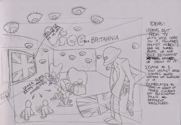
Ronald Searle was suggested too, and it's a neat art style, but a tad comical, really. Someone mentioned GTA Vice City as a suggestion, and while I do love the graphic novel-esque illustrations, it's far too colourful to incorporate into the ident. But then again, I might try that look out for the Union Jack Sword man, since I'm kind of going for an uncanny valley feel with his design. Speaking of which, a lot of people didn't catch on at all that he was holding a knife. I didn't use a real knife for reference when I designed it so it's no wonder people were confused. It actually looks more like a club than a knife. I'm redesigning it based on a bowie hunting knife now, but still, how I even tried to pass that off as a knife to begin with is beyond me.

Lastly, the rest of the feedback was on the presentation, being filled with too much text, and I agree with that, it should definitely just go straight to the point and present it more visually. The feedback was pretty useful so far. I was going to add a mock-up to the boards as well.

Our Rule Britannia Ident Ideas

Me and my partner have looked at a lot of ideas for this ident. Since it had to be a well-researched and well-thought idea, we've been through enough research and brainstorming to come up with our final idea.

The first idea my partner came up with at first was an establishing shot of a street party with a bunch of British citizens eating dinner together. It was going to focus the group in the party individually and the idea was that these are the types of people you find in Britain.

It's a decent idea to start off with, but I don't think it would have portrayed Britain as realistically as Vice would have wanted.

The second idea was also thought of by my partner, and it was sort of working with the theme of the the first idea, that UK is a place of varying individuals. The idea would have been a digital painting of Buckingham Palace (presumably traced over a photo) with a bunch of Brits and subcultures climbing out of the windows, again symbolising the varying individuals in UK society. I kind of brushed this idea off to be honest, since I didn't really engage with it, plus it kind of painted a pretty picture of Britain when Vice wanted a realistic one.


While my partner was having a blast in Animex, I was still at home thinking about some ideas. I thought about how to incorporate realistic themes into the ident, as well as how bleak I can actually be. I watched the current Rule Britannia ident, and it was... pretty damn bleak. It was literally just an image of the British flag only wrecked. I guess they are fans bleakness and anti-British government imagery. Not only that but the guidelines did say the ident had to portray Britain realistically, so I wondered how I could possibly portray my views on the state of the country realistically. After all, I think I've experienced enough to describe it in my own imagery. I got to thinking about society and how it functions, then I thought about how to incorporate my thoughts into more bleak and surreal images, since my partner wanted to get a bit more gritty during our partnership, and one of the reasons Fiona decided to work with me was that I can be quite dark with my work. Granted, my style is usually more comedic but I can try and go for seriousness this time around.

I was heavily influenced by Silent Hill when I thought of my idea. I developed the idea from Fiona's idea of the dinner party, and I wondered how I could take that idea and make it bleaker. I then thought, "what if they were being watched by eye balls protruding outside the walls?", since I happen to love that type of imagery involving human-like eye balls. I then thought, "what if they weren't even brits but rather minorities, hence the government watching them constantly?". I then remembered that the constant watch minorities get is not just from the government but even most British citizens do it, so I added a much closer brit that is so mistrusting that he watches them with the intent to kill, and he represents the average brit and his ideals. Then I thought "what if they weren't having dinner but instead watching a British Flag on the TV that symbolises British ideals being forced into their minds through TV like propaganda?". At the time I thought this could be well-established with one still image, with some slight motion graphics thrown in.

We wrote a list of ideas on this page. 

I also did an animatic for it. The music used is just to get an idea on what the music would be like.

Fiona liked this idea but was able to improve it. Firstly, she didn't want the people in the video to all be minorities, since the connotations behind that might not be clear to people. She said they should be a group of subcultures/lower class citizens rather than just minorities. I agreed it was a little more appropriate, given the context of the conservative government and upper class brits looking down on lower class brits. They are also no longer watching British propaganda but instead Vice Britannia.

This was developed into a final idea, in which it's basically the same only the setting changed from a generic living room to a tunnel, based on the Las Vegas tunnels that homeless people live in. It would also contain more of a narrative, in which the characters are watching TV but then the man with the Union Jack knife enters, and they all attack him by throwing the TV at him. This has the same connotations as before, but the added ending is symbolic of revolution, the poor fighting back at the upper class for oppressing others.


I think this idea is way more refined, and while it may take more time than I initially hoped to spend on this, I'll still go for it, because I think it conveys the message a bit more, and it gives me and Fiona a chance to be creepy with our animation.