Final piece.
Friday, 15 May 2015
Lip Syncing Process

Step 1: Make a Flash document with a green background and a dot depicting where the tracking dot will be.

Step 2: Draw and animate the facial features while always covering the tracking dot.

Step 3: Open up the stop-motion scene on After Effects.


Step 4: Export the facial animation from Flash as an image sequence and import onto After Effects (make sure you change the frame-rate to your preferred fps by right-clicking and then clicking Interpret Footage). After that, you just remove the green background by changing the screen colour to the same shade of green on the Keylight menu.

Step 5: Create a Null Object and place its centre point over the tracking dot.

Step 6: Open the tracking menu, place the Track Point over the tracking dot, and edit the Motion Target to the Null Object. Then click the buttons next to Analyse and if the Track Point moves the way you want it, click apply.

Step 7: Make sure the facial features cover the tracking dot and are aligned well with the null object, and then parent the facial animation with the null object.
Final Step: Look through the footage and make sure it syncs up well, and that it covers the tracking dot the whole time, before rendering it. You can edit the path of the Track Point in the tracking menu, plus you can resize and move the facial animation but it won't affect the tracking at all.
Tuesday, 12 May 2015
Photograph for Promotional Art
We were told to produce a photograph or an image of our work be used as part of a promo for the screening of everybody's work. Grace volunteered in doing our distribution work, but this was my contribution towards it.


What Has Changed Since the Final Crit
- The original recording was changed to one sung by somebody else, as the original wasn't as energetic.
- The character design for Symphony was altered so that she would wear lipstick, since originally the mo-cap dots would show far too much whenever her mouth was closed.
- Scenes that were meant to be animated in front of a green screen had to be changed, this was not suggested during the crit, rather it was something my team decided to change soon after it, as it would have gotten in the way of other projects being made by different groups, and the lights would have been too much of a hassle to book for the stop-motion room.
- There are now going to be tints added to the characters faces.
- If there is time, we will add a silhouetted crowd in the intro and certain other bits.
- There will be credits added to the intro scene.
Final Crit Feedback
The feedback for our final crits was mainly positive. Everyone enjoyed the animation, both with the expressions and the stop-motion animation, and laughed during it. I'm really proud of my team right now actually. They told us we should maybe add a silhouetted crowd and more sound effects, but overall every one really liked it. I think giving the time constraints, we could manage to add every neat little touch that we were pitched, but there may be compromises here and there.
Monday, 11 May 2015


.jpg)


Ren's Toothache and Tone of Voice
Our team have thought about tone of voice when making this. It's mainly come natural to us, though. Grace wrote the song and I feel like the lyrics are simple and entertaining enough for a young audience to understand. I also think they are One thing I wanted to keep in mind though, was the mentality of children. Something John Kricfalusi wanted to do when making The Ren & Stimpy Show was to make a series that kids can enjoy without being educated. I kind of agree with him on that. I freaking hated being told what to do when I was a kid, and normally just cared about entertainment. That's not to say every show that focuses on morals are inherently bad. I still enjoy shows like My Little Pony, Adventure Time, and Spongebob Squarepants, that manage to have lessons while still being entertaining.
What's interesting about The Ren & Stimpy Show was that despite being very anti-moral, there was one episode called "Ren's Toothache" was actually pretty educational. It was all about how Ren hadn't brushed his teeth so now his teeth got really sore, and of course his situation only got worse from there. The story is even structured in a manner typical of a documentary animation for kids. The intro shows Ren not listening to Stimpy warning him that if he doesn't brush, his teeth will fall out, then Ren begins to suffer the consequences of that, which leads to him still being stubborn, causing the situation to get even worse for him, and eventually the problem becomes unfix-able and Ren only has himself to blame for it. This is very unlike the show to do something like this, and may have even been something the staff was forced to make by executives. Strangely enough, this episode still doesn't feel out-of-place for the series. I think the reason for this is that while it does have a moral at the end, it still manages to balance that quite well with the typical humour of the show. It's all about the tone of voice. The episode is still very zany and slapstick-driven, and it doesn't use 100% true facts either (for example, it says the toothache was caused by a tooth beaver that gnaws away at people's nerve-endings, which I don't think is based on fact), but the message is put across quite well.
It really shows that you can educate kids without being too in their face about it. It's the kind of tone of voice that John K usually tells stories with in this show, the kind that teaches morals without making kids feel like they're in school again. This is the kind of tone of voice I wanted us to go for with our music video. It was written to feel like the kind of video kids are shown in school though, but really that's even more reason to make the video with this kind of tone. So that children are both educated and genuinely entertained.
That's Organic!
I'm extremely certain that this video was what inspired my partner, Grace, to make this animation. To be honest, I do rather enjoy it. It's cute and funny, plus its tone is appropriate for the target audience of children. It's also very entertaining, slipping in a few gags here-and-there, so that it's not solely documentary-driven. The animation is pretty bad though, but I feel like that kind of adds to its silly charm. The appeal comes from the cheesy voice-acting/singing and pleasant atmosphere. It's a very fun way to teach kids about healthy eating.
Character Design - Aubrey


I was thinking for this character, I would design him as this kind of groovy, and chill, guy. I figured for his character, he could look like the more quiet one of the group, but still a rather cool guy. I actually had the California Raisins in my head when I was told by Grace that the aubergine would play the saxophone. I also thought about the Animal crossing character, Brewster, mainly for his expressionless face, complimenting his overall calm demeanor.
Character Design - Manny


Manny was designed as this cute and rather simple looking guy, but still quite a fun character. I didn't really know how to characterise an orange significantly, since it's basically just a round object, so I was admittedly rather lazy with this design. That being said, I think simply giving him that dumb smiley face establishes quite a happy character, and he still stands out from the rest of the crew. I also managed to have some fun with the expressions too.
Character Design - Larry

Since I was told this character was supposed to be a lemon, I figured I would make him stand out, and make him unique to how people would typically design a character out of a fruit like this (which I gather is a rather specific thing to think about). I figured, rather than be predictable by simply putting a face on a lemon, but work around the shape of it too. I wondered how putting a lemon on its side would help this, and naturally made the side with a stalk on it be where the face is. Afterwards, the mustache kind of reminded me of a jolly old man so I just made his eyes small and have crow's feet. I figured it would add to this personality if I didn't try and get really exaggerated with his expressions, but instead maintain this expression the whole time.
Character Design - Pepé


Pepé was designed to be this rather insane character. I figured since this was a chilli pepper I'd give him a personality that suits their typically spicy flavour, so I designed him so that he was really angry, or at least very excitable.
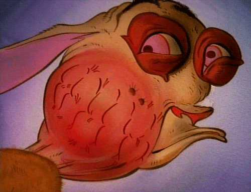
Character Design - Symphony


This character was designed with generally rather cute facial features. I wanted to go for a face that's cute but still very expressive, so that her facial animation can be entertaining to look at. I also really wanted more than just her face to be different but her general appearance to be unique to the other characters. Obviously, she automatically would look different to them, since she's... you know, a strawberry and all... but I wanted little details such as her stalk to have it's own idle position that differs from the rest, and the way in which her leaves are arranged to be different, also.
Wednesday, 6 May 2015
Oli Animation
I discovered this animator on Youtube with a channel simply called "Oli". What he does is very similar to what I'm doing, putting 2D facial expressions in front of a 3D model. The way he does facial expressions is incredibly good, pulling off some spumco-esque facial expressions that really push them to the extreme. I started thinking about this more when drawing the storyboards and animatic, trying to push the expressions a lot more. I love exaggeration a lot so I'm glad this made me think about it even more, when working in this manner.
Subscribe to:
Posts (Atom)