Thursday, 23 January 2014
Fire: Birth and Death - Completed

Adventure Time: Fire Animations
I used Adventure Time a lot for reference when animating fire, because it generally has some very well animated fire. The characters, Flambo and Flame Princess, were particularly influential, for the character design of the character in my video, and the general concept of a character made of fire.

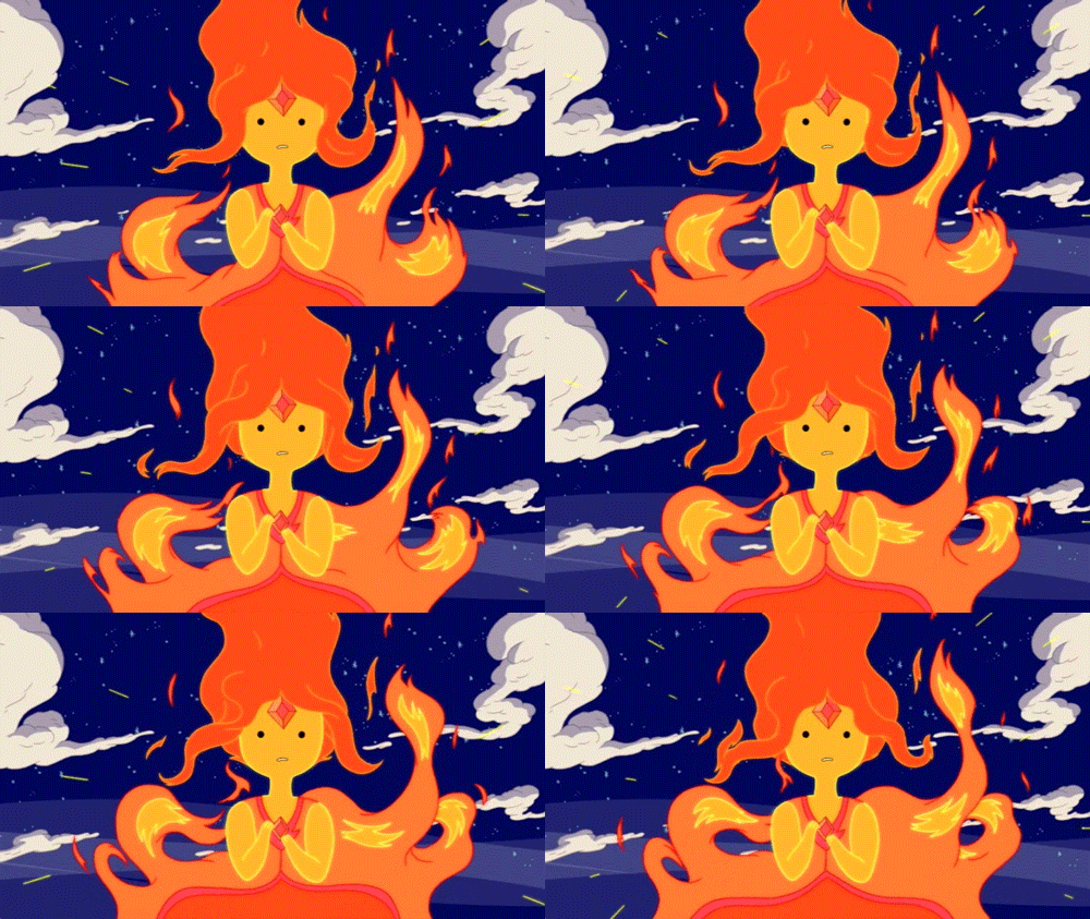
The fire doesn't move entirely realistic, but it works well with the art style. The character design is also done very well, using the upper part of the fire as hair and the yellow bits as their face.
I also looked at this image a lot for reference when animating the general flames in my animation:
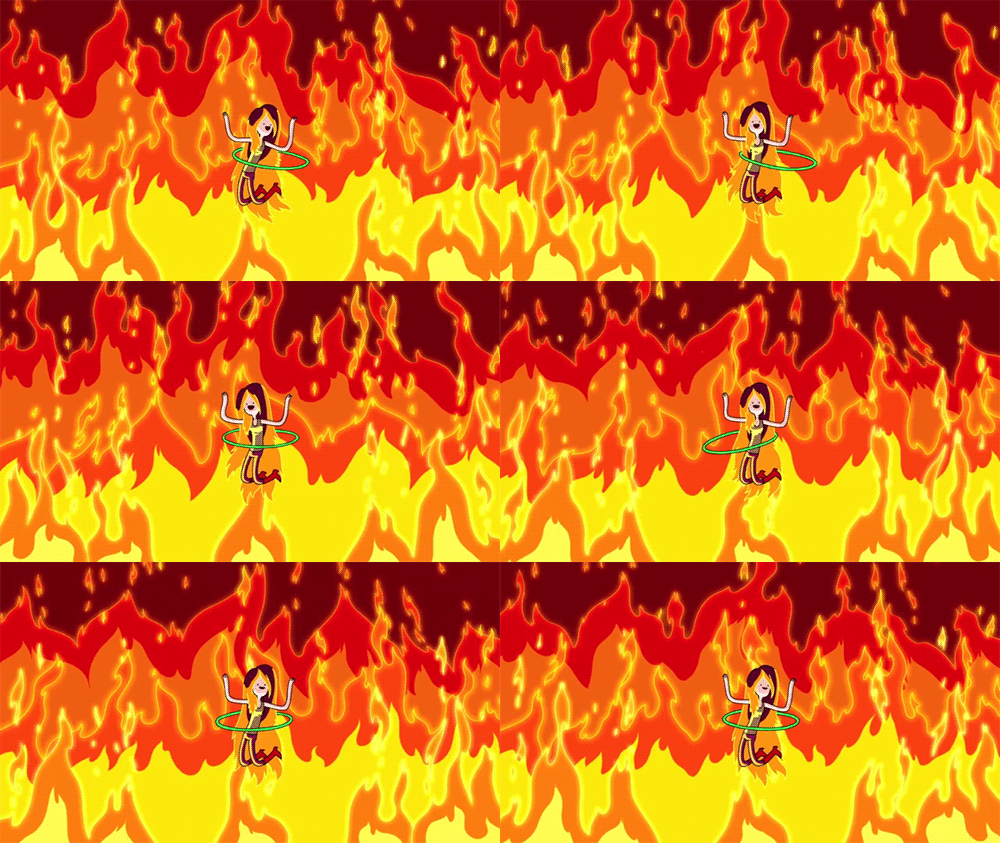
The fire doesn't move entirely realistic, but it works well with the art style. The character design is also done very well, using the upper part of the fire as hair and the yellow bits as their face.
I also looked at this image a lot for reference when animating the general flames in my animation:
Tuesday, 21 January 2014
My Little Pony: Friendship is Magic: Backgrounds

Just like Gravity Falls, this show also has backgrounds that stand out very well to me. As you can see from the image, it's a very different style to Gravity Falls, a lot more loose and stylised. I wanted to look at these backgrounds because they are made using Flash. Look at how well they are made and how they really bring the world to life. The textures are simple vector lines, curves, and swirls. They're simple textures but actually really effective at making the objects in the background more or less solid. The textures for the wood are close enough to how wood looks in real life, rough surface with several swirls on it. Finally, The far out landscapes, hills, and clouds make the world look vast and open.
Space Dandy

Space Dandy is a very recent anime made by Shinichiro Watanabe, creator of Cowboy Bebop and Samurai Champloo. It's very fascinating and surreal anime, being one of the most beautiful animes I've ever seen, but also focusing a lot on humour. And it is a very funny anime, the first episode is just okay but the second one floored me. Like most sci fis set in space, the aliens have some very cool and unique designs that really stand out. As I've said before, the animation is stunningly beautiful, with the sharp and dynamic arts style and vibrant colours, it really stands out as an anime, particularly today when most animes have the same tired moe art style.
Rayman Origins/Legends

This 2-D plat-former by Ubisoft is an example of 2-D video game graphics used extremely well. The animations for the characters are very well-done because of how exaggerated their motions are and how they follow the principles of animation. They are so full of character that game is just fun to look at, and it fits in very well with the silly tone and happy atmosphere. While gameplay is important, these games show that a unique art-style can make the game fun as well. This, and Ren & Stimpy, were my main sources of inspiration for the design of the character in my animation.
Monday, 20 January 2014
The Ren & Stimpy Show

This is a show made in the 90s by Nickelodeon Studios. It's about a dog and a cat that go on a lot of surreal adventures. It's very inconsistent, in terms of setting/location, which adds to the surreal aspect of the series. Of course, the characters themselves don't change at all, each story is just another bizarre journey that comes and goes. It can be disturbing at times, really disturbing. Ren is notorious for having a psychotic breakdown whenever he gets left alone or when Stimpy does something incredibly dumb. The aspect that always amazes me is how well animated the exaggerated movements and emotions are, pretty much every frame is a unique drawing of the characters. Ren's face would literally grow three times its size when he pulls one of his signature psycho grins.
Production of Fire: Birth and Death - Character Designs
Here are the designs for my character.

This sheet shows all the stages of its physical growth and how I intend to make him move during each phase. I highlighted the part about the fire's pattern because that is an essential aspect about fire that I have observed, that being that fire generally doesn't move in a consistent pattern, and the idea was that the flame's body moves just like a regular fire.

I wanted to focus a lot on the expressions of the flame, and a lot of that came from the character's eyes. So I made a sheet for its eyes to see how they'd look and how they'd move under certain circumstances. I made a note to think about John K's art style, because he generally focuses a lot on eye movement.
Saturday, 18 January 2014
Production of Fire: Birth and Death - Title Card
Rough Version:

Final Version:

This is the title card for Birth and Death. I thought I'd make this in the style of the Adventure Time title cards, with the grainy and surreal imagery. The whole thing was made to establish character, location, and story; it is also made to look rather grim and over-the-top so that it contrasts with the actual video's lighter mood.
Wednesday, 15 January 2014
Toy Story - 3D Animation.

Production of Fire: Birth and Death - Storyboard

^After the silhouette lights the cigarette and carelessly throws it on the floor, the match flame comes to life and leaves the cabin through the window.^

^The flame (now bigger) drops down the window and wanders aimlessly into the woods, leaving behind a trail of fire that burns down the house and forest.^

^The flame notices how big it's gotten, then notices the destruction it left behind to become bigger.^
Here's the animatic I made too:
Production of Fire: Birth & Death - The story.
I thought about what story to go with for the topic of elements. I had an idea for one about Water, that I immediately abandoned for this idea for a story about Fire. I looked at each of the four elements and thought about what each of the elements meant.
The thing that fascinated me about the fire was the destruction it can cause, that one tiny flame could spread extremely fast and cause a great deal of damage. That's when I thought about personifying a flame, so that it could react to the accidental destruction it's caused like a human being would. This would make it a character we can relate to because sometimes we make bad decisions and cause people suffering without realising it, and some people are just that bad that everything they do leads to bad consequences. That's basically what this character is like; a flame that can't help but cause needless destruction to everyone and everything around it.
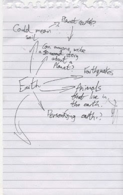
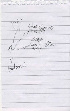

Yes, it does say "can fire be burned" at the top.
Sunday, 12 January 2014
Production of Fire: Birth and Death - The title
Seeing as I had the story in mind, I figured it could be summed up in two words. The "birth" of the flame and "death" of everything around it. The title is deliberately over-the-top "deep" because, while the short does sound rather depressing, I actually intend to make it more of a comedy. It's a dark, yet simple, title but I think it sums up the narrative of the short perfectly, a darkly humourous short that pokes fun of how this fire has lived and developed in such a short space of time at the suffering of others .
Steamboat Willie

Steamboat Willie is a film, from 1928, that marked the second appearance of Mickey Mouse, but more importantly was the first Disney film to be made with sound. Technically it wasn't made with sound per sé, it was originally released as a silent short, then re-released with sound, but I digress. It was rather revolutionary for its time, seeing as the sound effects and music were all timed very with the animation. It pretty set a standard on how to time synthetic sound effects for cartoons. The designs were all fun and unique, and the animation great too. The short itself, on the other hand... I wasn't a fan. Granted, the animation was great and the way they worked with the sound was awesome too, but from when Mickey found Minnie to the end, literally nothing happened, I got bored very quickly. Still, regardless of my feelings towards this, it goes without saying that this was a groundbreaking film and a decent introduction to sound in animated film.
Saturday, 11 January 2014
The Adventures of Prince Achmed (1926)

This is The Adventures of Prince Achmed, a film by Lotte Reiniger, and is the earliest known feature length 2-D animated film. This ambitious project was made by using puppets, that were created using black card, and moving them frame-by-frame in front of a light box. This technique made for some impressive imagery and character designs, a style that acclaimed animator of today, Henry Selick (Nightmare Before Christmas, James and the Giant Peach, and Coraline), is very reminiscent of. The settings and locations were simply beautiful and were really translated well by the technique used. Now this was clearly not an easy feat, all I know off the top of my head is that this took Reiniger 3 painstaking years to make. This was a 65 minute film and was animated at 24 frames per second (since production started the same time the average frame rate of film increased to between 20-25 fps). This film was truly ahead of its time, having used the 12 principles of animation before they were even really common knowledge.
Tuesday, 31 December 2013
Gravity Falls Backgrounds
I've been watching a lot of Gravity Falls throughout the holidays. I absolutely love this show, it's a fun and atmospheric show, that's well-written and has a clever narrative; as a kid's show it's not patronising, is a good introduction to a lot of mature plot elements and complex characterisation. On top of everything else, the animation is fantastic. The backgrounds in particular I love, they are just so beautifully drawn and add a lot to the mysterious atmosphere.

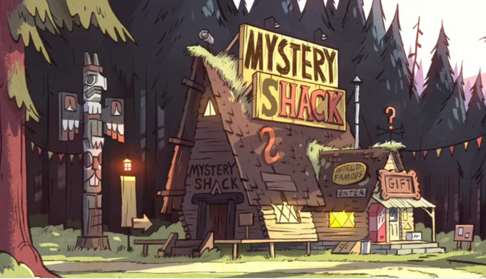
This image actually works both as a beautiful drawing and as a chilling background. It works so well with the tone they were trying to create, for what goes on deep in the woods.
This background is used to establish location quite a lot. The trees in the background appear as anonymous as ever, and the way they fade, the further into the background they go, creates a sense of isolation, the feeling of being lost in the middle of nowhere, and that the further into the woods they go the more mysteries they will find. And on a side-note, I love the little joke with the sign "Mystery Shack" spelling out "Mystery Hack" when the "S" falls off.
Monday, 2 December 2013
Flash Induction
I was learning how to use Adobe Flash today... Well, I say 'learning' but I actually knew how to use it anyway, but it managed to jog my memory about how to use it. We were looking at how to animate using pose-to-pose animation, which is pretty much the standard method on Flash. As usual, we animated a bouncing ball, a pendulum, and something extra to have fun with the software. Here's what I made:


I altered the in-betweens by converting the classic tweens to keyframes (if that makes sense). We weren't taught this in class but I'm just kind of accustomed to doing that now.
Monday, 11 November 2013
Apply: Lateness Animation
This is an animation we had to create to show our understanding of the animation course by applying what we have learned throughout this course. We had to create a short animation based on the theme of our choice, I picked Lateness. For this one, I took inspiration from something I had experienced that day and quickly drew a short 3-act structure in my sketch book.


This was very quickly thought up because I had a very similar problem at the time and a lot of times in the past too. I sketched it very quickly in the corner of my book, I thought it was good quick idea and just went with it. As you can see it was originally supposed to feature people in it, but I got kind of bored of them as I was making the storyboard, so instead I made it about ponies, an oc (original character) pony to be exact. I've drawn the star of the short so many times that I didn't really need to plan any drawings of her. I did, however design the teacher specially for this. I quickly designed him as a nice looking guy that goes completely insane when angry. I thought of this as I was making the storyboard too.
This is the main storyboard I used for the animation. It didn't turn out that differently in the end though, it's shot fairly similarly too. When I designed the teacher in the storyboard, I had thought about it quickly. This was the type of thing I thought of:
As you can see, the angry face is very much inspired by The Ren & Stimpy Show, with the exaggerated emotions in a similar style to that. Finally, as I was animating it, I made my own little animatic to get the timing right, and in the end I found myself spending countless hours doing the animation itself. I also spent a lot of time trying to apply what I had learned from the principles of animation and the story-telling task.I also applied some knowledge of cinematography, that I had learned from that task, plus my pixilation work. This is how it turned out in the end.
Ace Attorney (Video Game)

Ace Attorney is a video game series for numerous handheld consoles and the Nintendo Wii. It's a rather unique video game, being a visual novel that stands out with its own gameplay elements. The animation is actually really good but basic. The investigation segments are in a first person perspective, and the characters each had a specific movement depending on how they're feeling. They are still rather appealing and full of character though, and they follow the principles of animation fairly well, considering the graphical capabilities of the original console they were released for. See, the first three Ace Attorney games are actually originally made for the Gameboy Advance, yet the cutscenes and animations are very well-done, with effective lighting and often film noir style imagery. They tell an effective story through the use of very basic animations, that hold up to the standards of many great visual novels, in fact it may have even set the standards of visual novel animation, seeing as lot have done it in this style since.
Adventure Time
I'm clearly not alone in saying that Adventure Time is a brilliant show. The loveable characters, surreal humour, cute art style, and brilliant story all make it an amazing cartoon. I would personally call it surrealist art, rather than just another silly kid's show though. For starters, there are a lot of dark aspects of the show that are hidden underneath the bright and upbeat atmosphere. It's no secret anymore that the show is set in a post-apocalyptic world, but before now, the only way to know that would be if you were to really analyse it and catch all the hints that were hidden in the background, or some major ones that would appear for one frame. Plus, even though the art style is cute and reminiscent of a child's drawings, and they spend a lot of time in the Candy Kingdom, a brighter and more up-beat setting but every so often they will wind up in a more darker location, like a cave full of monsters or an old post-war setting. Even with all these dark aspects, though, the show is still light-hearted and silly, and this contrasting tone is surreal to me. There is also a sense of growing maturity as the show progresses. The protagonist, Finn, grows older as the show goes on. In the first season he's more immature and is more of an excitable little kid, but the more he gets older, the more serious the show gets. Finn starts to discover what it's like to date a girl, the value of his friends, and responsibility. It seems to be a made like a dream-world, created by a young boy's psyche that matures the older he gets.
Saturday, 9 November 2013
Pixilation: Predator and Prey
My study task here was to create a short 600-1000 frame animation that conveys the theme of predator and prey, using an animation technique known as Pixilation. I thought about how I should convey this idea of a predator catching its prey and tried having fun with it. So the first idea that came to my mind was the idea of a student getting lured into their room and eaten alive by it. I developed on this idea by writing notes about how exactly the room would come alive.

I was mainly influenced by Jan Svankmajer as I was planning this. I took his style and applied it to my story. Because it's a short video, there wasn't really enough to add on top of what I went with so as I was making a storyboard very quickly in my sketchbook, I thought about what I was capable of doing and using that. So changes were made for the short in my storyboard. I did, however, focus on how it would be shot and what would be symbolic of a predator catching its prey.


There wasn't much change from the storyboard to the actual pixilation in the end, there were some changes I thought were more suitable.
Jan Svankmajer
Jan Svankmajer is quite a unique filmmaker and surrealist in my opinion. He doesn't really rely on much of a narrative but his shorts do have some kind of story tell, and normally contain underlying themes that relate to the social politics of his country. They mostly revolve around the theme of system and routine, and how everything tends to fall apart once they are either changed in any sort of way, or taken away completely. Dimensions of Dialogue is a great example of that too. What I especially enjoy about Jan Svankmajer's work is that it can actually be viewed positively whether you understand them or not. They can be very humorous and the animation is brilliant, particularly for fans of pixilation.
Deadly Premonition
This is a strange game to say the least. It's in no way a 'good' game, it's enjoyable for some bizarre and complex reason. I'm not sure if the game is intended to be viewed this way, I mean there are some genuinely funny moments in it, and York is decent character too. But it is technically a horrible game, the graphics don't really match up to the standards of every other Xbox 360 and Playstation 3 game, the gameplay is pretty basic, plus in almost every possible way it rips off Twin Peaks. So why do I love this game so much? Well writing is very cheesy and the style is very quirky. The graphics are awkwardly over-the-top, I mean they're supposed to look realistic but the way they move is like a bad PS2 JRPG. That actually kind of suits the style of the game though, it's a dark story with a gritty art style, but that doesn't mean it can't be a bit silly. And who could go another a minute without seeing York's hilarious smile?

Pretty infectious. He's normally got such a straight face too.
Those graphics aren't the best but I can't help but love how bad they are, it fits in so well with the narrative. I still don't know if the graphics are supposed to be this bad, but if they are then kudos to Swery, the director of the game, because these graphics make this game heavily enjoyable.
Pose to Pose Animation
This was an exercise to see if we can animate a pendulum swinging using a technique called Pose to Pose, in which you draw keyframes that would show a particular movement has been made, and then add frames in between those key frames that generate the illusion of the movement actually being made. When drawing the in-betweens, they also had to show easing in and easing out to create the feeling of a swinging motion.

This was fairly easy to make with a light box, and the technique made things a lot quicker too. I can see myself in the future animating a basic walk-cycle using this exact method, moving the arms in a similar manner to the pendulum and creating extremes for the legs.
Friday, 8 November 2013
Oreo TV Commercial
Sick of those awful Oreo adverts we get over here in Britain, the ones with that little teaching her Dad how to eat one? Well this should be a more than refreshing change from that then. This is an advertisement from America that's done completely differently. The brand has a pretty cute jingle here and the animation works perfectly with it. The transitions between the characters' actions run smoothly and make the style a lot more effective. It makes Oreos seem a lot more creamy and irresistible. I also love how it makes fairy-tale creatures, vampires, and vicious sharks seem a lot more friendly, making this a really uplifting piece as well. This is a perfect example of advertising done well, and anyone working in advertising, especially in the UK, should learn from it.
Ray Harryhausen
Ray Harryhausen has had a huge impact on my love for stop-motion animation. Ever since I was a child, I had this deep fascination in animation within my subconscious, an interest that eventually clawed its way out in the near present when I decided to pursue a career in that field, so whenever I'd see a Ray Harryhausen film was on TV, I would always be absorbed by my couch seat just from looking at the stop-motion monsters. It was funny though, I never knew why I had such a love for the monsters, but I think it was because they were so well designed and the way they moved made them seem even scarier to me. The famous skeleton battle from Jason and the Argonauts in particular stuck with me. I've never imagined skeletons moving any differently since I saw that film. As far as I know, this was how I was introduced to stop-motion, rather than Wallace & Gromit and the lesser-known Trap Door which I used to constantly. They had such an impact on me as kid that I even preferred those special effects over CGI, I've even grown to detest most CGI (most not all).
Pacific Rim: Special Effects
Do you know about Pacific Rim, probably the hypest and greatest film this summer? I just really want to talk about the special effects for this film because I have waited so long for a modern day mecha-film to animate robots with CGI and actually do it right! Because for the longest time we've had to endure the horrendously over-the-top CGI robots from Michael Bay's Transformers, and any other film that decided to emulate that technique of animating giant robots. Now, granted I am the type of guy that appreciates a film that goes over-the-top with its action sequences, but robots, let alone giant ones, don't move that swiftly! I don't care if the robots in Transformers are alien robots, as long as they are big and metal they will follow Earth's physical limitations! This is one disbelief I will not suspend, especially considering they got those physics right in the far lower budgeted and incredibly dumb mecha-show Power Rangers. So you can imagine my relief when I finally saw the film Pacific Rim. The robots not only moved realistically, but they also moved in sync with the actors as they were connected to all that tech. And yes, the set for the shots inside the jaegars were all filled with real honest-to-god tech. I wouldn't be surprised if they were what took up most of the film's budget, but it was because Del Toro wanted the actors themselves, and by default the characters, to really feel like they were controlling giant robots and really feel the aches and bruises from it. This is how you animate giant robots, people!
Hanna-Barbera Sound Effects
As I was editing my animation about Lateness, I started adding sound effects via the CD box of Hanna-Barbera sound effects we have here in college. Before then it was just some box that sat in corner to me, and yet as of now, after going through and listening to them, I suddenly got the importance of sound effects in animation. They aren't very realistic sound effects, in fact a lot of them are sounds that you wouldn't normally hear under the circumstances in which they made in cartoons; however, they make a world of difference once they are added. The sound effects themselves are surprisingly common. You'll hear them in almost every cartoon, video game, etc, after the shows they came from. Futurama, for example, uses a lot of sound effects from The Jetsons. Even the Resident Evil games have used the sound effects for growling dogs. Honestly there are far too many stuff to list, but that just shows how much of an impact their sound effects have added to animation in general. I'll definitely be using those CDs a lot from now on!
Thursday, 7 November 2013
Reflections - by Bosmatt Agayoff & Alon Ziv
Reflections
This is a short I can relate to. It's about a grown man who plays with his window-reflection, that resembles him as a child, but is looked down on for it by everybody around him. The art style is cute and Disney-esque but works well when it the tone becomes more bleak. It very well represents society's reaction to a man who just wants to have fun, like the child still inside him. To me, it's similar to how it's looked down upon for grown ups to enjoy animation or video games because they are generally seen as a purely childish thing. I can also relate to it, having been tempted to play with toys many times before but been worried by how others would respond. One thing I appreciate, though, is that while this short does have a bleak ending, they didn't go overboard like most indie animated shorts tend to do (he doesn't somehow die in the end or something). The tone is as innocent as a children's animation, which is fitting for the protagonist. I also love the symbolism, such as his literal childhood reflection, also those two extras that pick him up and clean him up symbolic of society's need to basically be a parent to him. A truly well-made and brilliant short, that I'm sure anyone who's ever been picked on for being a "man-child" will appreciate.
This is a short I can relate to. It's about a grown man who plays with his window-reflection, that resembles him as a child, but is looked down on for it by everybody around him. The art style is cute and Disney-esque but works well when it the tone becomes more bleak. It very well represents society's reaction to a man who just wants to have fun, like the child still inside him. To me, it's similar to how it's looked down upon for grown ups to enjoy animation or video games because they are generally seen as a purely childish thing. I can also relate to it, having been tempted to play with toys many times before but been worried by how others would respond. One thing I appreciate, though, is that while this short does have a bleak ending, they didn't go overboard like most indie animated shorts tend to do (he doesn't somehow die in the end or something). The tone is as innocent as a children's animation, which is fitting for the protagonist. I also love the symbolism, such as his literal childhood reflection, also those two extras that pick him up and clean him up symbolic of society's need to basically be a parent to him. A truly well-made and brilliant short, that I'm sure anyone who's ever been picked on for being a "man-child" will appreciate.
My Little Pony: Friendship is Magic

Wednesday, 6 November 2013
Lee Hardcastle
Lee Hardcastle (Youtube channel)
Lee Hardcastle is a claymation animator on Youtube who mainly does film/video game parodies but also does some original shorts. I really like his dark and quirky style, it really fits with his dark humour. These are really well-animated too, in fact it's probably some of the best looking claymation blood ever. You've probably heard of him before, this is his most famous video (and also his funniest, in my opinion):
It's one of the more comedic surreal animations on the internet. The designs on the aliens are both funny and translate pretty well the claymation. The fact that their expressions never change makes them seem all the more sinister, but that just makes their bizarre intentions even funnier, and the fact that they went as far as to bring in a giant too.
Lee Hardcastle is a claymation animator on Youtube who mainly does film/video game parodies but also does some original shorts. I really like his dark and quirky style, it really fits with his dark humour. These are really well-animated too, in fact it's probably some of the best looking claymation blood ever. You've probably heard of him before, this is his most famous video (and also his funniest, in my opinion):
Mystery Sketch 2011: Bongcheon-Dong Ghost
Bongcheon-Dong Ghost (Warning Really Scary!)
This an interesting flip book type animation. It doesn't use a flipbook or is even on paper, but after scrolling down to a certain point in the webcomic it automatically scrolls the page down several times and as it goes through the panels the image appears to be moving. It's really effective at shocking its reader, because you don't expect a webcomic to be animated in this way.
This an interesting flip book type animation. It doesn't use a flipbook or is even on paper, but after scrolling down to a certain point in the webcomic it automatically scrolls the page down several times and as it goes through the panels the image appears to be moving. It's really effective at shocking its reader, because you don't expect a webcomic to be animated in this way.
Republican Space Rangers
There is a feature in Grand Theft Auto IV (and possibly in GTA V, I haven't played it yet) that is more fun than running down innocents. In every safe house there is a TV you can sit down and watch. If you do that you get a selection of funny shorts, fake advertisements, and other funny stuff. Republican Space Rangers is a particularly funny one. The animation is rather cheaply done but I think that adds to the comedic style. In some cases, animated comedy seems to work better for me if it focuses more on the writing and characters than the animation. This is an example of that, as well as other more renowned animated comedies like Flinstones and South Park.
Tuesday, 5 November 2013
Plague of Gripes (Youtube Channel)
Plague of Gripes is an animator on Youtube who generally creates animated shorts by taking audio footage from Lets Players, such as Two Best Friends Play and Game Grumps (Youtubers that record gameplay footage along with commentary), and uses their conversations to create little scenarios in animated form. They're extremely funny and the audio he uses actually fit in very well with the scenarios he creates. One in particular that I enjoy is Morons vs Wild, which manages to make audio of some guys having a laugh whilst playing a video game and completely re-imagining it to a little short about two guys having a terrible time in a jungle whilst getting laughed at in the background.
To better understand, here's the Plague of Gripes video:
and here is the original video that he took the audio from:
It's amazing how well it translates into animation.
To better understand, here's the Plague of Gripes video:
and here is the original video that he took the audio from:
It's amazing how well it translates into animation.
Monday, 4 November 2013
Squash and Stretch
We got to work on looking at the 12 principles of animation. We mainly used The Animator's Survival Kit, The Illusion of Life, and Drawn to Life for reference, and in the end it was fairly simple animating a ball bouncing using the principle "squash and stretch".


I made this with a flipbook, hence the bad quality. I think it moves pretty well, considering I had no way of onion-skinning, making the process a lot harder. I created the feeling of light weight and soft mass for the smaller ball (the one with the happy face) by making it stretch further upon impact. You can also tell it's light because of how high it bounces back up. I deliberately made the bigger ball seem heavier by bouncing simultaneously with the smaller one but going up lower too. You can tell it's soft because it still squashes and stretches.
We then had to make another one using squash and stretch, as well as the principles, spacing and timing. So I made a ball bouncing along a short path. The ball doesn't squash and stretch as much as in the first flipbook, that was because I wanted to make this ball seem more solid than the first two, like a golf and/or 8 ball. You can see how much of a difference it makes. I probably should have made the ball bounce a bit higher so that it would seem more realistic, other than that I think it flows fairly well.
Lastly, we had to make a third flipbook with a little bit more character this time. This basically meant I should follow another of the 12 principles, overlapping movement and secondary actions. So this was a bit more complex than the other two but I think I handled it well. I looked at the diagram in the Animator's Survival Kit of the ball moving with a cloth wrapped around it and, rather than just copy that, I tried something different and gave the ball arms, eyes, and a hat which would all move as it bounced, then added a comedic twist to the conventional bouncing ball flip book. I also added a touch of anticipation by way of animating the eyes, the way it looks in the direction it's moving. Its arms stretch and wave depending on whether the ball is in the air or bouncing back up, and the hat drops slower then lands back on the head as the ball ascends.
Storyboards: Incy Wincy Spider
My storyboard task was to produce a storyboard of a nursery rhyme by creating a narrative in our own style for it. We started off by using thumb-nailing (storyboarding using sticky notes), which allowed us to quickly edit something we didn't like by throwing away a frame and drawing it differently (as opposed to throwing away a template and starting over again).


So this was my interpretation of the nursery rhyme. You can see that the spider has a purpose for going up the water spout, that isn't revealed until the end of the storyboard. I tried giving some character to the spider's design, so that it has aesthetic appeal. I figured it would just be a generic spider only with some facial features, a tuft of hair and two big cartoony eyes with three little ones on either side of the head. It would also use its front legs as arms. these features make the spider seem more "human" and therefore easy to connect to.
This is how the storyboard ended up:


As you can see, there were a few changes made but it has the same idea. In this final version, you can see the lighting is important, particularly in the last page. This was to symbolise the different moods of each scene and how they contrast between the gloomier opening and the happier tone of the ending.
This is how the storyboard ended up:
Subscribe to:
Posts (Atom)