The sets in the film are all disorienting, due to the manic structures and dynamic imagery. It's an unconventional approach to filmmaking even by today's standards, but they work so well with the tone of the film, as well as the subject matter, being the character's psychological state of mind.
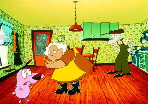
This takes a more stylistic approach to the backgrounds. They're used in generally the same manner as Dr Caligary, creating an environment that is twisted and disturbing. The colours are very vibrant and have high levels of contrast, adding a more lighthearted mood to show, but still looking generally quite bleak and disorienting, adding to the more disturbing look of the show.
Steven Universe's environments have more of a pleasantness to them, the idea being the juxtaposition of the generally bleak nature of the narratives and the gorgeous backgrounds, establishes the world as a beautiful where bad stuff happens. I'm more looking at the method for creating these environments, rather the environments themselves, though. I want to incorporate this technique into the style I'm going for, because the way the lines and colours work, plus the digital look, sets the scene remarkably well and lets the moving objects stand out more.
The environments are all drawn digitally, giving them an artificial but still full of character look. The outlines appear to be drawn first, with colour and texture of the object added in a different layer, and is quite a rough line, that gets thicker to add to the depth of field. When colour and texture is added, they typically don't snap to the outline completely, the space between the colour/texture boundaries are at least a few pixels away from the outline. The outline's colour is normally a darker shade of the colour of the object (like the grass's outline would be a darker green) adding to the digital style and making the object blend with the rest of the environment. If, however, the environment used low key lighting, the outlines would be a lighter colour. Lastly, to emphasise texture, a lot of layers are used, and are set to "overlay" and "multiply" mode, primarily using the same colour for those layers, as opposed to the conventional shades of grey, to make the colours more vibrant.
I think I have the technique down, I'll see I can make an environment, not for the title sequence but to try out using the techniques I looked at.


No comments:
Post a Comment