Thursday, 23 January 2014
Fire: Birth and Death - Completed
Adventure Time: Fire Animations
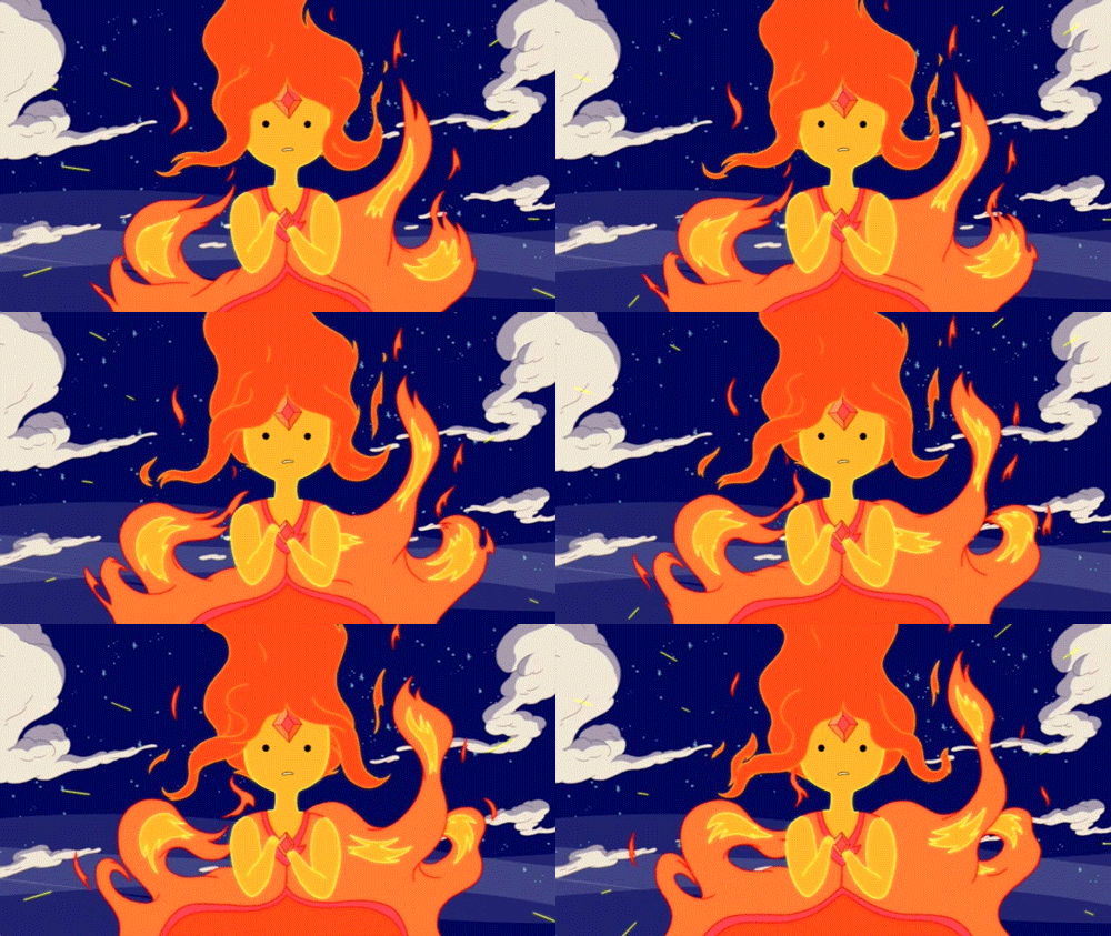
I used Adventure Time a lot for reference when animating fire, because it generally has some very well animated fire. The characters, Flambo and Flame Princess, were particularly influential, for the character design of the character in my video, and the general concept of a character made of fire.
The fire doesn't move entirely realistic, but it works well with the art style. The character design is also done very well, using the upper part of the fire as hair and the yellow bits as their face.
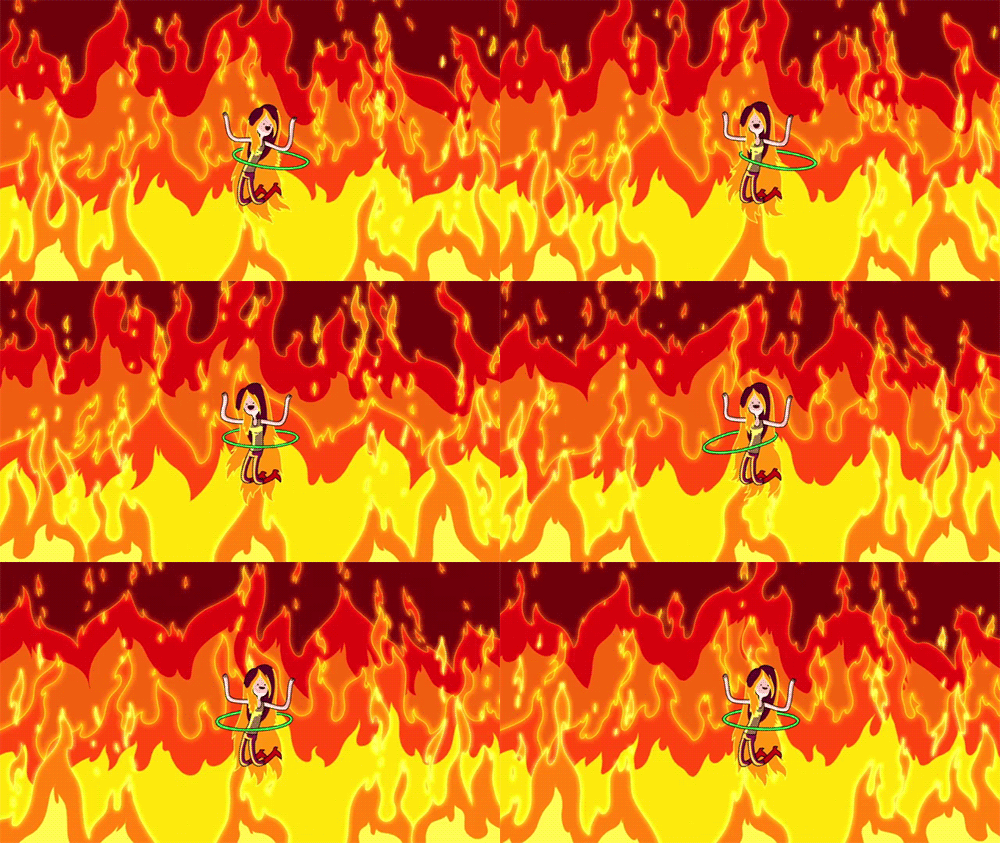
I also looked at this image a lot for reference when animating the general flames in my animation:
The fire doesn't move entirely realistic, but it works well with the art style. The character design is also done very well, using the upper part of the fire as hair and the yellow bits as their face.
I also looked at this image a lot for reference when animating the general flames in my animation:
Tuesday, 21 January 2014
My Little Pony: Friendship is Magic: Backgrounds
Just like Gravity Falls, this show also has backgrounds that stand out very well to me. As you can see from the image, it's a very different style to Gravity Falls, a lot more loose and stylised. I wanted to look at these backgrounds because they are made using Flash. Look at how well they are made and how they really bring the world to life. The textures are simple vector lines, curves, and swirls. They're simple textures but actually really effective at making the objects in the background more or less solid. The textures for the wood are close enough to how wood looks in real life, rough surface with several swirls on it. Finally, The far out landscapes, hills, and clouds make the world look vast and open.
Space Dandy
Space Dandy is a very recent anime made by Shinichiro Watanabe, creator of Cowboy Bebop and Samurai Champloo. It's very fascinating and surreal anime, being one of the most beautiful animes I've ever seen, but also focusing a lot on humour. And it is a very funny anime, the first episode is just okay but the second one floored me. Like most sci fis set in space, the aliens have some very cool and unique designs that really stand out. As I've said before, the animation is stunningly beautiful, with the sharp and dynamic arts style and vibrant colours, it really stands out as an anime, particularly today when most animes have the same tired moe art style.
Rayman Origins/Legends
This 2-D plat-former by Ubisoft is an example of 2-D video game graphics used extremely well. The animations for the characters are very well-done because of how exaggerated their motions are and how they follow the principles of animation. They are so full of character that game is just fun to look at, and it fits in very well with the silly tone and happy atmosphere. While gameplay is important, these games show that a unique art-style can make the game fun as well. This, and Ren & Stimpy, were my main sources of inspiration for the design of the character in my animation.
Monday, 20 January 2014
The Ren & Stimpy Show
This is a show made in the 90s by Nickelodeon Studios. It's about a dog and a cat that go on a lot of surreal adventures. It's very inconsistent, in terms of setting/location, which adds to the surreal aspect of the series. Of course, the characters themselves don't change at all, each story is just another bizarre journey that comes and goes. It can be disturbing at times, really disturbing. Ren is notorious for having a psychotic breakdown whenever he gets left alone or when Stimpy does something incredibly dumb. The aspect that always amazes me is how well animated the exaggerated movements and emotions are, pretty much every frame is a unique drawing of the characters. Ren's face would literally grow three times its size when he pulls one of his signature psycho grins.
Production of Fire: Birth and Death - Character Designs
Here are the designs for my character.
This sheet shows all the stages of its physical growth and how I intend to make him move during each phase. I highlighted the part about the fire's pattern because that is an essential aspect about fire that I have observed, that being that fire generally doesn't move in a consistent pattern, and the idea was that the flame's body moves just like a regular fire.
I wanted to focus a lot on the expressions of the flame, and a lot of that came from the character's eyes. So I made a sheet for its eyes to see how they'd look and how they'd move under certain circumstances. I made a note to think about John K's art style, because he generally focuses a lot on eye movement.
Saturday, 18 January 2014
Production of Fire: Birth and Death - Title Card
Rough Version:
Final Version:
This is the title card for Birth and Death. I thought I'd make this in the style of the Adventure Time title cards, with the grainy and surreal imagery. The whole thing was made to establish character, location, and story; it is also made to look rather grim and over-the-top so that it contrasts with the actual video's lighter mood.
Wednesday, 15 January 2014
Toy Story - 3D Animation.
Production of Fire: Birth and Death - Storyboard
^After the silhouette lights the cigarette and carelessly throws it on the floor, the match flame comes to life and leaves the cabin through the window.^
^The flame (now bigger) drops down the window and wanders aimlessly into the woods, leaving behind a trail of fire that burns down the house and forest.^
^The flame notices how big it's gotten, then notices the destruction it left behind to become bigger.^
Here's the animatic I made too:
Production of Fire: Birth & Death - The story.
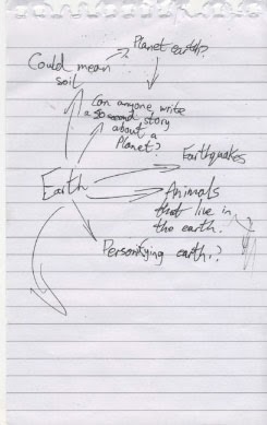
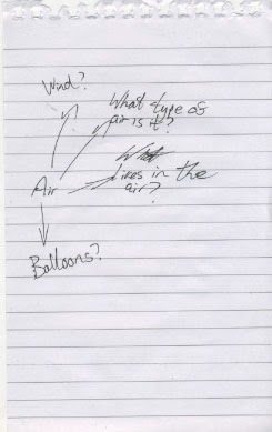
I thought about what story to go with for the topic of elements. I had an idea for one about Water, that I immediately abandoned for this idea for a story about Fire. I looked at each of the four elements and thought about what each of the elements meant.
The thing that fascinated me about the fire was the destruction it can cause, that one tiny flame could spread extremely fast and cause a great deal of damage. That's when I thought about personifying a flame, so that it could react to the accidental destruction it's caused like a human being would. This would make it a character we can relate to because sometimes we make bad decisions and cause people suffering without realising it, and some people are just that bad that everything they do leads to bad consequences. That's basically what this character is like; a flame that can't help but cause needless destruction to everyone and everything around it.
Yes, it does say "can fire be burned" at the top.
Sunday, 12 January 2014
Production of Fire: Birth and Death - The title
Seeing as I had the story in mind, I figured it could be summed up in two words. The "birth" of the flame and "death" of everything around it. The title is deliberately over-the-top "deep" because, while the short does sound rather depressing, I actually intend to make it more of a comedy. It's a dark, yet simple, title but I think it sums up the narrative of the short perfectly, a darkly humourous short that pokes fun of how this fire has lived and developed in such a short space of time at the suffering of others .
Steamboat Willie
Steamboat Willie is a film, from 1928, that marked the second appearance of Mickey Mouse, but more importantly was the first Disney film to be made with sound. Technically it wasn't made with sound per sé, it was originally released as a silent short, then re-released with sound, but I digress. It was rather revolutionary for its time, seeing as the sound effects and music were all timed very with the animation. It pretty set a standard on how to time synthetic sound effects for cartoons. The designs were all fun and unique, and the animation great too. The short itself, on the other hand... I wasn't a fan. Granted, the animation was great and the way they worked with the sound was awesome too, but from when Mickey found Minnie to the end, literally nothing happened, I got bored very quickly. Still, regardless of my feelings towards this, it goes without saying that this was a groundbreaking film and a decent introduction to sound in animated film.
Saturday, 11 January 2014
The Adventures of Prince Achmed (1926)
This is The Adventures of Prince Achmed, a film by Lotte Reiniger, and is the earliest known feature length 2-D animated film. This ambitious project was made by using puppets, that were created using black card, and moving them frame-by-frame in front of a light box. This technique made for some impressive imagery and character designs, a style that acclaimed animator of today, Henry Selick (Nightmare Before Christmas, James and the Giant Peach, and Coraline), is very reminiscent of. The settings and locations were simply beautiful and were really translated well by the technique used. Now this was clearly not an easy feat, all I know off the top of my head is that this took Reiniger 3 painstaking years to make. This was a 65 minute film and was animated at 24 frames per second (since production started the same time the average frame rate of film increased to between 20-25 fps). This film was truly ahead of its time, having used the 12 principles of animation before they were even really common knowledge.
Subscribe to:
Comments (Atom)


