Wednesday, 19 March 2014
Visual Language - My Sketchbook - 3
This is based on an idea for a film I had when I witnessed a cat getting run over near my house. It's about a black cat that got hit by a car one night and survived but was left with a broken leg, so he wants to sue God for being created in his image, because if he wasn't black then he would been noticed by the driver and therefore would have been fine. It's weird, yeah, but I liked it so much because of that, plus the idea that if we are created in God's image and if God is real, then technically we could sue him for not making us adaptable in some way. I've always wanted to eventually develop on this more.
Visual Language - My Sketchbook - 2
Another one from a while back. It's a drawing of myself, based on one of my profile pictures on Facebook. I just wanted to see if I could capture a subject in low-key lighting, and I figured by doing this I could differentiate the heavy shadows with my really dark hair.
Visual Language - My Sketchbook - 1
A sketch book can be a great place for artists to express themselves and make notes about their experiences. It is a good way to develop their fascination with drawing to a whole new level. Sketchbooks are considered the birthplace of ideas, because what started out as a small sketch could develop into something huge, even if it's an idea that was thought up on a whim, or something doodled on a sheet of paper. I have numerous examples from my own sketch book that I want to go through bit-by-bit.
This is actually something I drew a long time ago, on a different sketch book. It was just something I drew because I thought about the amount of trouble office workers, students, artists, etc go through and how it is very often taken for granted. I used a weird German Expressionist style and dutch tilt to represent the despair and stress this worker is being put through. This is just so surprisingly relevant today that I felt like showing it on this blog.
Life Drawing in Animation: Movement
Finding a model to do multiple poses that establish a directional movement, then that's almost the same as using footage of that as reference. In fact, that can even benefit you if you are animating a character in a particular art style, by drawing the shapes of whichever art style the character is drawn in. You normally have to observe a real person acting out the scene you're making to gain enough reference to pull it off. It might not even be a basic walk-cycle, but more complex actions that may involve interacting with other objects/people. This would require knowledge concerning real-life people performing said actions. Having enough life-drawing experience will enable you to draw the basic shapes of the required movements when looking at reference and getting the shapes down in your character's actions.
Life Drawing in Animation: Emotion
This is another aspect that's important when animating a character, their poses. A common occurrence in animation, normally when you're drawing extremes, is that your character will have to do many poses, whether it be a squash/stretch pose, an anticipation pose, one that establishes mood through body language, or even more subtle facial/bodily gestures. To pull off a dynamic pose, you would have to know the common principles of anatomy to pull it off.
For example, if you were to draw a happy character pointing triumphantly at the air; it may sound easy because you can already visualise it, but you would have to stop and consider the how it could be pulled off, and that's when you think back to life-drawing. Think about the drawing as a 3-D object, not to mention the angle you're viewing the pose from, and the shape. If it's being viewed, say, from a high angle, and the focus is on the character's left side, then you should think about how to establish that, and fore-shortening would be a solution. The right side of the body would face away from the camera, and right leg would be pointing in that direction, so in order to get a sense of depth, the left side of the body would be drawn bigger than the right side, and the left leg would point towards the camera. Next, the arm pointing up should match general shape of the arm pointing down, and would probably be drawn slightly longer for the sake of exaggeration. If you consider how a real life person would do it, then you should be fine.
Life Drawing in Animation - Character Design
Life drawing plays a huge part in character design, because without practicing anatomy you won't have a proper grasp on human anatomy, and therefore will not be able to create an anatomically correct character. You would also need it to develop your own art style, so that you can stylise/simplify the character. Mike Matessi's book Force: Character Design from Life Drawing basically says this. If you can establish force with a character then that will help define it. Do the shapes you draw allow the character to move in the way you would allow it too? Does the character look enough like a human to add appeal? Is their age defined well enough, or their gender, or even their personality? These are all principles to consider when incorporating life-drawing to character design.
Tuesday, 18 March 2014
Life Drawing
I recently did some life drawings, each group with their own theme and/or guidelines, which I've always somehow neglected over the years, because I never really saw the importance of it until recently. First, I had to draw at least 12-18 poses, per person, that establish movement through a space, and I had to spend 10 seconds per pose. This felt like it was my pace because I'm sort of used to that nice, loose style and method of drawing, and this was literally just drawing lines and shapes that establish the flow, direction, pace, and body language of the moving individual. I then had to draw the same thing, only instead I was drawing shapes to establish squashing and stretching in an open space, and having drawn squashes and stretches since starting animation, this was fairly simple, and also good practice. Next, I had to draw four poses, for five minutes each, that established the figure pushing and pulling on an object. I feel like I need to work on the pushing drawings a bit more, and some of my pulling drawings were fine apart from a slight screw-up on the anatomy. Lastly, I had to draw four more drawings, this time focusing more on the shape, anatomy, and weight of a model. I'd have to spend 20-30 minutes on each drawing, not having to focus too much on detail but still getting the overall figure correct. I did fairly well at that, having used different types of media for each drawing, it let me think creatively to establish the figure's colour, and depending on the body language of the model, I would use media to establish mood.
Responding to Sound - Spongebob Squarepants "My leg"
There is a running gag in Spongebob Squarepants which involves a faint sound of a male voice shouting "my leg" whenever an extra or a large group of extras is somehow harmed off-screen. The guy is actually voiced by Mr Lawrence, the voice actor for Plankton, who stands out as a rather deep-voiced guy. Spongebob predominantly tends to use Hanna-Barbera sound effects, with some original sounds as well, but the one that stands out to fans of the show is Mr Lawrence yelling "my leg". I think the reason that one stands out so much is because the voice is very distinctive beyond the other groaning extras, or often it's the one sound effect used, sort of like the famous Wilhelm scream, but it's mainly that it just sounds funny because of the way Mr Lawrence delivers the line.
Responding to Sound - The Ricky Gervais Show
Sunday, 16 March 2014
Responding to Sound - Tom & Jerry
The Tom & Jerry shorts are all perfect with their use of sound. They are timed perfectly and normally work well with the animation and the situation they are used in. Plus, in true Hanna-Barbera fashion, the sound effects used are all unrealistic and over-the-top but work well with the lighthearted, surreal, and comical tone of the show. The show's use of sound effects has basically set a standard for conventional cartoons, like the use of certain sounds when a character jumps or even changing expressions just fits the tone and keeps the audience in the same wave-length as the series. It has probably the best use of a human scream sound effect; by giving Tom a human-like scream, it adds to the humour because Tom never speaks so the idea that he has a human scream adds an extra kick to the slapstick humour.
Friday, 14 March 2014
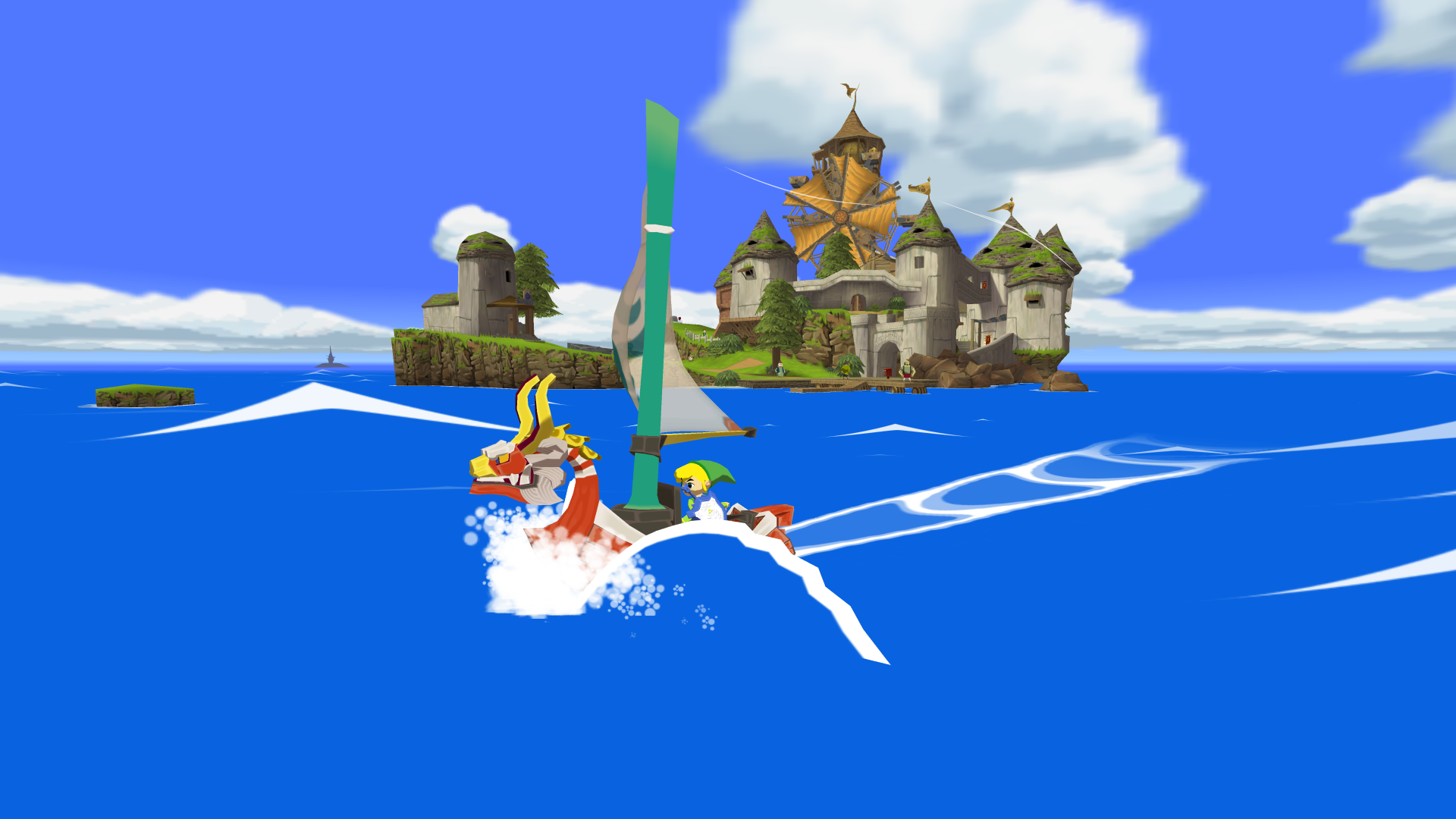
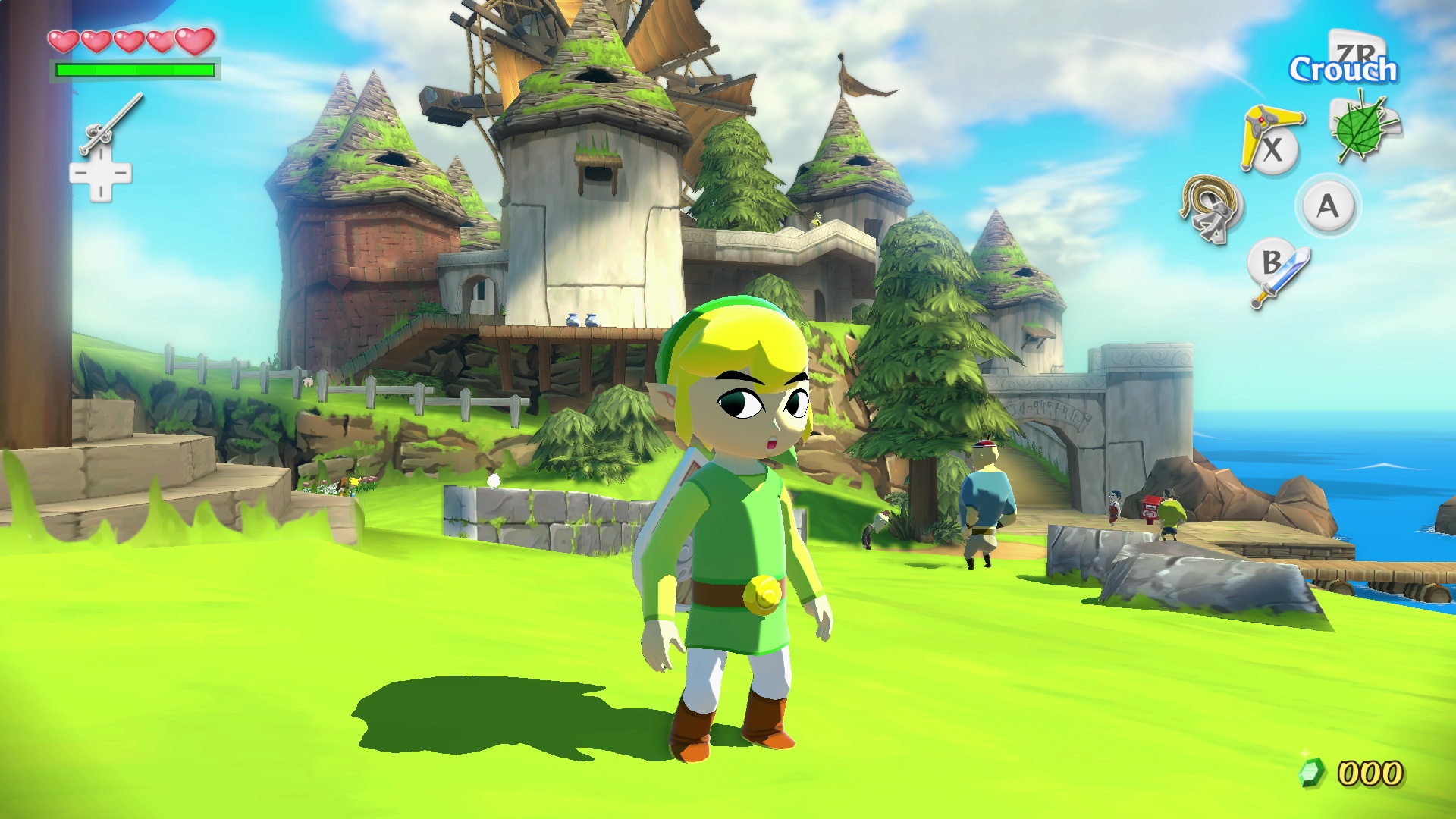
Environmental Story - The Legend of Zelda: The Wind Waker
The Legend of Zelda: the Wind Waker, is a visually stunning video game with a very unique art style, especially for a game in the Legend of Zelda series. The environments you explore have simplistic textures but are very well-stylised and draw the player into the world, because of how well the art style establishes the mood of this world and the story being told. The art style is so creative that certain areas can fit the style but still establish a generally bleak and, in the case of the old Hyrule Castle underwater setting, even quite eerie atmosphere. As this is a video game, there is mise-en-scene that the player can find by exploring the environments that further tell the story.
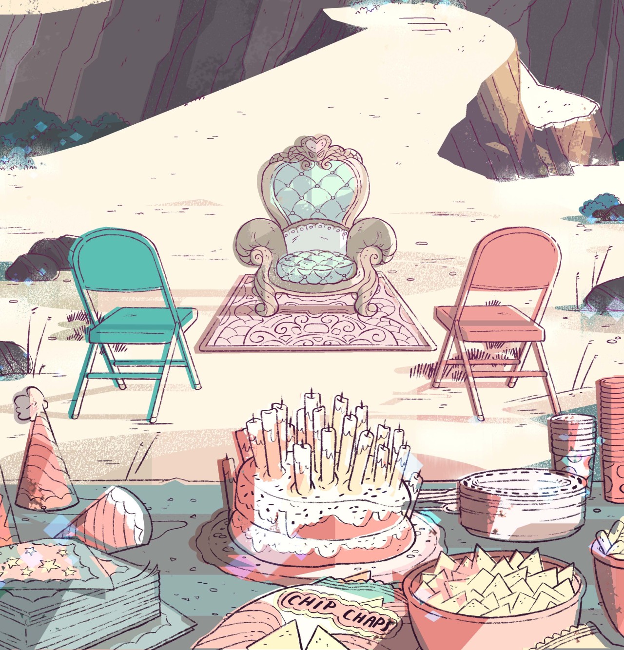
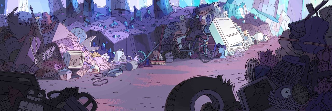
Environmental Story - Steven Universe
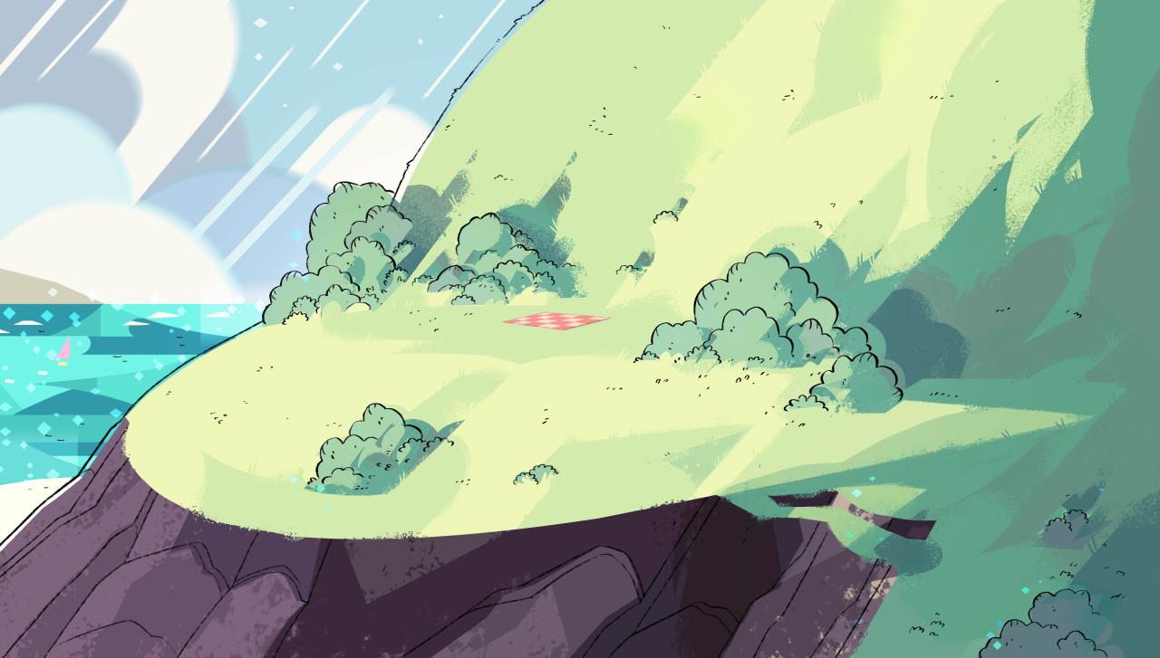
The environments in Steven Universe are unique in the sense that it doesn't always fit the show's art style, but still works at setting the tone. The colours are all bright and vibrant, and the textures, while mostly smooth, have the sense of feeling like the texture i.e. when characters walk on stone or grass, you can really that they are. The setting and environments are all visually stunning, and even when the show gets dark at times, the environments are still beautiful, which rather than that sense of contrast be distracting, it instead shows that even the world is beautiful, it doesn't mean it never gets bleak at times.
Environmental Story - Kill La Kill
Monday, 3 March 2014
Anatomy
So after deciding on the art style for the characters, I thought about the anatomy. I looked at the character designs for Panty & Stocking with Garterbelt and Invader Zim, and thought about how they relate in terms of anatomy.
They both have pretty wacky designs for the characters, very expressive and over-the-top. I've always thought they both heavily resembled german expressionism in terms of anatomy, as well as a sense of John Kricfalusi's art style, moreso with Panty and Stocking.
So I thought more about their influences and looked at some german expressionist artists.
First I looked at Karl Schmidt-Rottluff, whose paintings are generally nasty portrayals of humans, their facial features are accurate but the overall shapes of the body parts are jagged and surreal. They are also given a bizarre combination of vibrant colours, each combination being different to make each figure distinctive.
These expressions have become very influential in terms of character design and figuring out what expressions would be used.
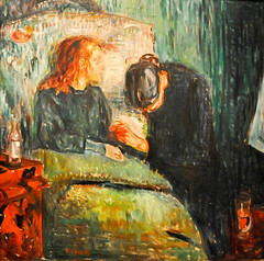
I also looked at Edvard Munch. His paintings are generally quite bleak, with mostly dull colours and low key lighting. They can still be quite lively though but the contrast between the dark colours and exaggerated imagery is what makes them so disturbing. The heavy detail in the brushwork makes the imagery all the more unnerving, because the images are all dynamic and stylistic but the brush work is so detailed that it seems like they were trying to be depicted realistically, making them seem more nightmarish.
The backgrounds are especially unnerving, and incorporating this art style into my character design is what I intend on doing.
Character Development
I looked at several art styles and character designs for my animations and took inspiration from a number of artists. I generally wanted my animation to have a surreal and unnerving look to it, and there are many ways for me to go about that.
I originally wanted the characters to look quite realistic, in a similar sense to art style for Monster, because that would make the body horror aspect seem more horrific. I also thought it would seem more intense if I made all the shadows completely jet black, instead of the usual grey tint that cartoons usually have, similar to how Suda 51's No More Heroes is animated. I thought this was an interesting idea but figured I'd try a different approach, because the original story had a sharper, lighter edge whilst also being incredibly dark and horrific. I looked at other ways to approach that, something more stylistic.
These were other ideas on how to design the character, Shinji. I incorporated my own art style into some of these ideas, but generally I was going for something a bit more expressive and stylistic. A few of these were inspired by other Manga, one being Attack on Titan, which admittedly I just plain ripped off, which is why I didn't go with it. I tried designing him in my usual art style, which you can see on the top-right of the page, but I quickly abandoned that design, because it just didn't suit the tone of the story. I then tried a more simpsons-esque approach, I liked the exaggerated look of the eyes, though it still looked a bit overly toony. I then tried an approach similar to Invader Zim, which I've mentioned before, and it actually works quite well, but it matched the art style of the show a bit too much, and I didn't want it be derivative, so I added a touch of my own art style, which is basically a stylised version of the "moe" art style used often in anime. I also took some inspiration from the rather unique anime, by Hiroyuki Imaishi, Panty & Stocking with Garterbelt.
Labels:
Applied Animation,
Character Development,
OUAN 406,
R&D
Friday, 21 February 2014
Invader Zim (art style)
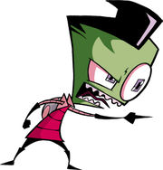
Since I'm aiming the title sequence for western audiences, and given Parasyte's got a humourous tone whilst still being dark and gruesome, I figured I'd take inspiration from Invader Zim, a rather depraved show, especially for a target demographic of kids. It's about an alien called Zim who gets sent to Earth from a faraway planet and tries to invade it whilst posing a school boy to avoid suspicion. Certainly one of the darker kid's shows , and the art style very much adds to that.
As you can see, the characters are all shaped very strangely and have very sharp and exaggerated outlines. Their eyes vary in size, but are generally known for being rather huge and disproportionate. The imagery, overall, is just really grim and surreal, so it suits the dark and twisted tone of the show.
Labels:
Applied Animation,
Invader Zim,
OUAN 406,
R&D,
Reference
Tuesday, 18 February 2014
Parasyte (manga)
I decided to make the title sequence based on the japanese graphic novel, Parasyte. After looking at many novels and graphic novels, it was hard to find one that I had read that hasn't been adapted to film/television. I think, considering the manga is only 10 volumes long, it would work best as a mini-series title sequence, which are generally no different to a conventional TV series title sequences.
In terms of target audience, I'd say it would have to appeal to teenagers and young adults, seeing as it is set in a typical high school and primarily stars teenagers. Is is actually a darkly comic story, that takes a rather deep and satirical look at human nature. This could be adapted for western audiences, as a zanier and more demented show with a rather stylistic visual portrayal of the characters.
Title Sequence
After much consideration, I decided to choose the task of making a title sequence. There are a number of reasons I made this choice, one being that I have a geeky love for title sequences. I also figured this would be relevant to my aspects in life, to generally create more narrative-driven animations, and this would be a great place to start with short title sequences. I have many ideas on how I would create an animated title sequence, but I'm mainly looking at the sequence being mainly in 2-D. I have an idea on what to base the title sequence on, so I can begin planning he sequence.
Monday, 10 February 2014
Idents/Titles/Campaign
For my next task, I'll have a choice between making a TV channel ident, a title sequence for a film or series, or a short campaign.
The channel ident would be interesting, because you can get some fascinating pieces of animation from them, particularly the E4 ones, seeing as some of them are made the notorious Cyriak. They can be interesting or just simple shots of the logo appearing, a more conventional approach.
I have always had a love for title sequences, because they aren't easy to make and aren't always necessary, in fact a lot of Hollywood films of today have stopped using title sequences or use them at the end of the film, strangely enough. But I love the concept of establishing tone and narrative, and they're quite mandatory, for me anyway, because they can help excite the audience or ease them into the story.
There was also the choice of creating a campaign ad for either Amnesty International, or Childline. This would be an interesting task for me, to see if I can create something more serious and sympathetic. On the other hand, I've never enjoyed campaign ads, mainly for personal reasons that I won't go into, so I can't see myself choosing this task.
The channel ident would be interesting, because you can get some fascinating pieces of animation from them, particularly the E4 ones, seeing as some of them are made the notorious Cyriak. They can be interesting or just simple shots of the logo appearing, a more conventional approach.
I have always had a love for title sequences, because they aren't easy to make and aren't always necessary, in fact a lot of Hollywood films of today have stopped using title sequences or use them at the end of the film, strangely enough. But I love the concept of establishing tone and narrative, and they're quite mandatory, for me anyway, because they can help excite the audience or ease them into the story.
There was also the choice of creating a campaign ad for either Amnesty International, or Childline. This would be an interesting task for me, to see if I can create something more serious and sympathetic. On the other hand, I've never enjoyed campaign ads, mainly for personal reasons that I won't go into, so I can't see myself choosing this task.
Thursday, 23 January 2014
Fire: Birth and Death - Completed
Adventure Time: Fire Animations
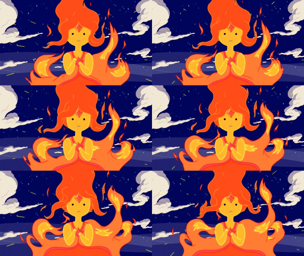
I used Adventure Time a lot for reference when animating fire, because it generally has some very well animated fire. The characters, Flambo and Flame Princess, were particularly influential, for the character design of the character in my video, and the general concept of a character made of fire.
The fire doesn't move entirely realistic, but it works well with the art style. The character design is also done very well, using the upper part of the fire as hair and the yellow bits as their face.
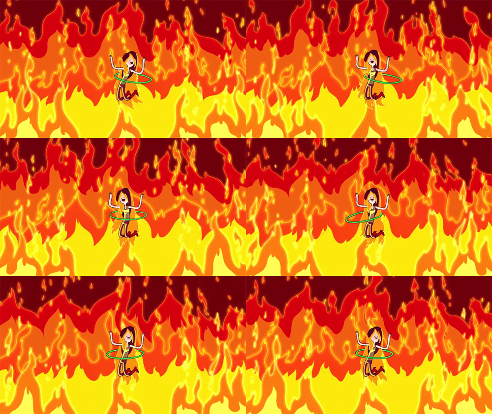
I also looked at this image a lot for reference when animating the general flames in my animation:
The fire doesn't move entirely realistic, but it works well with the art style. The character design is also done very well, using the upper part of the fire as hair and the yellow bits as their face.
I also looked at this image a lot for reference when animating the general flames in my animation:
Tuesday, 21 January 2014
My Little Pony: Friendship is Magic: Backgrounds
Just like Gravity Falls, this show also has backgrounds that stand out very well to me. As you can see from the image, it's a very different style to Gravity Falls, a lot more loose and stylised. I wanted to look at these backgrounds because they are made using Flash. Look at how well they are made and how they really bring the world to life. The textures are simple vector lines, curves, and swirls. They're simple textures but actually really effective at making the objects in the background more or less solid. The textures for the wood are close enough to how wood looks in real life, rough surface with several swirls on it. Finally, The far out landscapes, hills, and clouds make the world look vast and open.
Space Dandy
Space Dandy is a very recent anime made by Shinichiro Watanabe, creator of Cowboy Bebop and Samurai Champloo. It's very fascinating and surreal anime, being one of the most beautiful animes I've ever seen, but also focusing a lot on humour. And it is a very funny anime, the first episode is just okay but the second one floored me. Like most sci fis set in space, the aliens have some very cool and unique designs that really stand out. As I've said before, the animation is stunningly beautiful, with the sharp and dynamic arts style and vibrant colours, it really stands out as an anime, particularly today when most animes have the same tired moe art style.
Rayman Origins/Legends
This 2-D plat-former by Ubisoft is an example of 2-D video game graphics used extremely well. The animations for the characters are very well-done because of how exaggerated their motions are and how they follow the principles of animation. They are so full of character that game is just fun to look at, and it fits in very well with the silly tone and happy atmosphere. While gameplay is important, these games show that a unique art-style can make the game fun as well. This, and Ren & Stimpy, were my main sources of inspiration for the design of the character in my animation.
Monday, 20 January 2014
The Ren & Stimpy Show
This is a show made in the 90s by Nickelodeon Studios. It's about a dog and a cat that go on a lot of surreal adventures. It's very inconsistent, in terms of setting/location, which adds to the surreal aspect of the series. Of course, the characters themselves don't change at all, each story is just another bizarre journey that comes and goes. It can be disturbing at times, really disturbing. Ren is notorious for having a psychotic breakdown whenever he gets left alone or when Stimpy does something incredibly dumb. The aspect that always amazes me is how well animated the exaggerated movements and emotions are, pretty much every frame is a unique drawing of the characters. Ren's face would literally grow three times its size when he pulls one of his signature psycho grins.
Production of Fire: Birth and Death - Character Designs
Here are the designs for my character.
This sheet shows all the stages of its physical growth and how I intend to make him move during each phase. I highlighted the part about the fire's pattern because that is an essential aspect about fire that I have observed, that being that fire generally doesn't move in a consistent pattern, and the idea was that the flame's body moves just like a regular fire.
I wanted to focus a lot on the expressions of the flame, and a lot of that came from the character's eyes. So I made a sheet for its eyes to see how they'd look and how they'd move under certain circumstances. I made a note to think about John K's art style, because he generally focuses a lot on eye movement.
Saturday, 18 January 2014
Production of Fire: Birth and Death - Title Card
Rough Version:
Final Version:
This is the title card for Birth and Death. I thought I'd make this in the style of the Adventure Time title cards, with the grainy and surreal imagery. The whole thing was made to establish character, location, and story; it is also made to look rather grim and over-the-top so that it contrasts with the actual video's lighter mood.
Wednesday, 15 January 2014
Toy Story - 3D Animation.
Production of Fire: Birth and Death - Storyboard
^After the silhouette lights the cigarette and carelessly throws it on the floor, the match flame comes to life and leaves the cabin through the window.^
^The flame (now bigger) drops down the window and wanders aimlessly into the woods, leaving behind a trail of fire that burns down the house and forest.^
^The flame notices how big it's gotten, then notices the destruction it left behind to become bigger.^
Here's the animatic I made too:
Production of Fire: Birth & Death - The story.
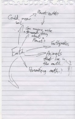
I thought about what story to go with for the topic of elements. I had an idea for one about Water, that I immediately abandoned for this idea for a story about Fire. I looked at each of the four elements and thought about what each of the elements meant.
The thing that fascinated me about the fire was the destruction it can cause, that one tiny flame could spread extremely fast and cause a great deal of damage. That's when I thought about personifying a flame, so that it could react to the accidental destruction it's caused like a human being would. This would make it a character we can relate to because sometimes we make bad decisions and cause people suffering without realising it, and some people are just that bad that everything they do leads to bad consequences. That's basically what this character is like; a flame that can't help but cause needless destruction to everyone and everything around it.
Yes, it does say "can fire be burned" at the top.
Sunday, 12 January 2014
Production of Fire: Birth and Death - The title
Seeing as I had the story in mind, I figured it could be summed up in two words. The "birth" of the flame and "death" of everything around it. The title is deliberately over-the-top "deep" because, while the short does sound rather depressing, I actually intend to make it more of a comedy. It's a dark, yet simple, title but I think it sums up the narrative of the short perfectly, a darkly humourous short that pokes fun of how this fire has lived and developed in such a short space of time at the suffering of others .
Steamboat Willie
Steamboat Willie is a film, from 1928, that marked the second appearance of Mickey Mouse, but more importantly was the first Disney film to be made with sound. Technically it wasn't made with sound per sé, it was originally released as a silent short, then re-released with sound, but I digress. It was rather revolutionary for its time, seeing as the sound effects and music were all timed very with the animation. It pretty set a standard on how to time synthetic sound effects for cartoons. The designs were all fun and unique, and the animation great too. The short itself, on the other hand... I wasn't a fan. Granted, the animation was great and the way they worked with the sound was awesome too, but from when Mickey found Minnie to the end, literally nothing happened, I got bored very quickly. Still, regardless of my feelings towards this, it goes without saying that this was a groundbreaking film and a decent introduction to sound in animated film.
Labels:
disney,
mickey mouse,
OUAN 405,
Steamboat Willie,
walt disney
Saturday, 11 January 2014
The Adventures of Prince Achmed (1926)
This is The Adventures of Prince Achmed, a film by Lotte Reiniger, and is the earliest known feature length 2-D animated film. This ambitious project was made by using puppets, that were created using black card, and moving them frame-by-frame in front of a light box. This technique made for some impressive imagery and character designs, a style that acclaimed animator of today, Henry Selick (Nightmare Before Christmas, James and the Giant Peach, and Coraline), is very reminiscent of. The settings and locations were simply beautiful and were really translated well by the technique used. Now this was clearly not an easy feat, all I know off the top of my head is that this took Reiniger 3 painstaking years to make. This was a 65 minute film and was animated at 24 frames per second (since production started the same time the average frame rate of film increased to between 20-25 fps). This film was truly ahead of its time, having used the 12 principles of animation before they were even really common knowledge.
Subscribe to:
Posts (Atom)